
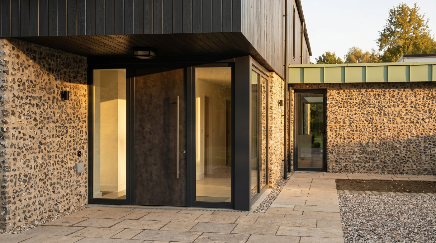
Should Your Windows and Front Door Be the Same Colour?
Your windows and front door do not have to be the same colour. Matching can create a quiet, consistent elevation, while a different door colour can give the entrance a deliberate focus. Either approach can work when it relates to the building’s proportions, materials and existing features. The choice is an architectural decision rather than a universal rule.
Start by deciding what the entrance should contribute to the house. A recessed front door may need a different treatment from a broad glazed entrance, and a period frontage presents different questions from a new extension. Whether the setting is Bath stone, a Wiltshire cottage or a Bristol terrace, the useful task is to develop a coherent palette and verify it with actual finishes.
Start With the Architecture and the Existing Palette
Look at the house before choosing the door and window colours in isolation. The wall material, roof, gutters, porch and retained joinery already create a palette. Identify which elements will remain and which are changing. A finish that looks attractive on a sample board may have a different effect beside the actual brick, stone or render that forms most of the elevation.
The arrangement of the openings matters too. Repeated windows can create a strong rhythm, while the entrance may sit centrally, at one side or within a shaded recess. A shared colour can reinforce that rhythm, but it is only one way to achieve cohesion. Consider the relative size and position of the door before assuming it should receive exactly the same treatment.
Include the surrounding street where relevant, particularly on a terrace or within an established group of houses. The intention may be to maintain continuity while giving the entrance an individual character. That discussion does not establish a local colour rule or settle any permission requirement. It simply ensures that a decision made at close range also makes sense as part of the wider view.
Gather representative material samples and suitable photographs of the actual building. Use them to identify a small number of relationships you want to test, rather than collecting unrelated favourite colours. An architect or designer can help clarify which existing tones are important. This gives the door and windows a shared starting point, whether the final decision is matching, related or deliberately contrasting.
Decide Whether the Entrance Should Blend In or Stand Out
A front door often has a different visual role from the windows around it. You may want visitors to recognise the entrance easily, or prefer it to sit quietly within a restrained frontage. Decide which intention suits the house. A different colour can create emphasis, but the strength and extent of that contrast need to relate to the entrance’s scale and setting.
Matching the door and windows can be effective where the elevation already contains several materials or prominent features. It may provide a calmer connection between openings. That does not mean every component must be identical in every room or on every side of the property. The visible composition should guide the decision, with internal finishes considered separately where the proposed products allow it.
A contrasting door can work where the entrance benefits from a clear focal point. Consider how the colour relates to a porch, steps, planting or nearby metalwork, rather than treating it as an isolated accent. A small recessed leaf may carry a different visual weight from a large door with sidelights. The same colour choice can therefore produce quite different results across two houses.
Describe the intended effect in plain terms before settling on a shade. Quiet, prominent, warm or restrained are useful starting words when tied to the actual elevation. They are more helpful than a rule that a front door must stand out. The resulting choice should serve the building and household’s preference, without relying on a promise about fashion or resale value.
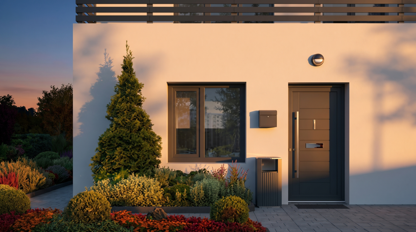
Understand Matching, Tonal and Contrasting Schemes
A matching scheme uses the same intended colour across the relevant windows and entrance components. Its appeal can be simplicity and continuity, particularly where openings are read together. The specification still needs to address the actual finish of each product. A shared colour reference alone does not define texture, sheen or every detail needed to achieve the intended relationship in manufacture.
A tonal scheme uses related colours with a difference in depth or character. The door might have a stronger tone while the windows remain quieter, allowing the entrance to be distinct without introducing a completely separate palette. Test the relationship with samples. Small differences that are obvious indoors can become subtle outside, while a seemingly restrained contrast may become stronger beside the wall material.
A contrasting scheme gives the entrance a more deliberate separation. That can involve a different colour family or a different material expression, but it should still relate to the rest of the house. Look for a reason the combination belongs together, such as its connection with the masonry or retained joinery. Contrast works best when the intended emphasis is clear and proportionate.
These are design approaches rather than technical categories with fixed boundaries. You do not need to decide that one is universally correct before seeing the options. Develop a few coherent alternatives and compare the whole entrance and elevation. A simple visual study can help, provided digital colour remains a guide to composition rather than final evidence of the product finish.
Compare Actual Finishes Rather Than Colour Names Alone
Colour names are useful communication tools, but similar names from different ranges do not necessarily describe the same appearance. Even a shared reference leaves other finish characteristics to be agreed. Establish the actual product and coating or paint system, together with the intended sheen and texture. This is particularly important where the windows and door use different materials or come from different manufacturers.
RAL’s digital colour guidance explains that screen representations are approximations and recommends physical samples for final decisions. Use digital images to explore the palette, then review representative finishes. A phone screen or printed image cannot establish the exact result on the house, and photographs should not be treated as binding samples simply because they look convincing during an online discussion.
Gloss and surface texture can influence how a colour is read. RAL’s semi-matt sample range illustrates that the finish of the reference itself is identified. For the project, compare samples relevant to the proposed products and inspect them together. Avoid assuming a painted timber leaf and a coated metal frame will have an indistinguishable surface because their nominal colour references agree.
Existing finishes add another layer of judgement. An aged window or retained door may no longer appear as it did when first finished. Decide whether the aim is exact matching, a close relationship or a deliberate difference, and discuss what can realistically be achieved. Keep the approved samples and the manufacturer’s information together so the intended result is clearer before the order is confirmed.
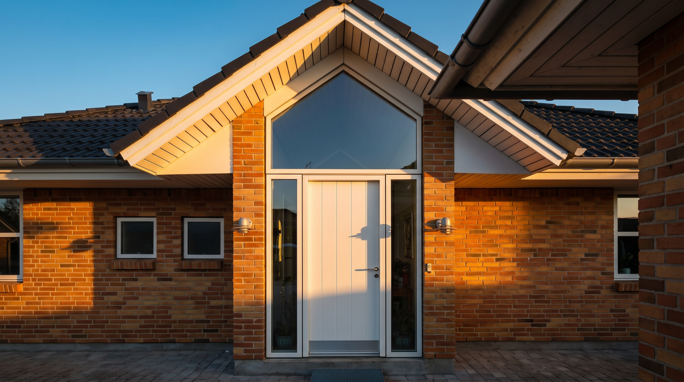
Consider Frames, Door Leaves, Side Panels and Hardware
The entrance contains more than the moving door leaf. Its frame, sidelights, fanlight and nearby panels may form a substantial part of what is seen. Decide which components should connect with the windows and which should belong to the door’s contrasting treatment. A simple drawing with finishes assigned can reveal a more balanced solution than choosing one colour for the entire assembly by default.
A contrasting leaf within a frame related to the windows is one possible approach. Another is to treat the whole entrance as a distinct element. Neither arrangement suits every building, and the actual product configuration can limit the available combinations. Confirm the choices with the relevant provider rather than assuming a showroom colour option can be applied independently to every part.
Hardware also contributes to the palette. Handles, hinges, letter plates, house numbers and other visible fittings can introduce another metal or colour. They do not all need to match literally, but their relationship should be considered. Too many unrelated choices can make a restrained entrance feel fragmented, while a carefully repeated finish can help connect a door with the wider frontage.
Keep functional requirements within the discussion. A colour preference should not lead to an unsupported hardware substitution or an alteration to an agreed security or operating arrangement. Select from appropriate options for the actual doorset. This allows the visual decision to remain coordinated with the product specification, rather than treating decorative components as interchangeable accessories after the main order has been settled.
Review the Street View, Entrance and Interior Together
Review the proposed palette at more than one distance. From the street, repeated window frames and the overall door colour may dominate. At the entrance, surface character, hardware and joints become more visible. Inside, the relationship with the hall and adjacent rooms matters. A successful scheme should make sense across these views without relying on one carefully chosen photograph.
Take physical samples to the property and view them in the intended orientation where practical. Consider shade, direct light and changing conditions rather than relying entirely on a bright showroom. A recessed entrance can read differently from an exposed upper-floor window. This is a reason to assess the actual relationship, not a prescription that shaded doors must always be lighter or more colourful.
Internal and external finishes can be separate decisions where the selected systems offer that option. The hall might need a different relationship from the front elevation, particularly where retained internal joinery is important. Confirm what is available and which components can differ. Dual-colour availability, cost and limits depend on the actual products; they should not be assumed from a general design idea.
For a Somerset renovation or a Wiltshire self-build, bring the architect or interior designer into the review where relevant. The decision may affect more than the glazing order, including decoration or an adjoining porch. Agree the palette while those relationships can still be coordinated. This helps avoid a late discovery that separately approved finishes look disconnected when seen together at the completed entrance.
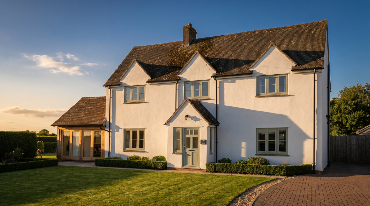
Check Permissions and Retained Historic Features
Where the building or setting has relevant constraints, establish them before treating a colour change as a purely decorative choice. Planning, listed building consent and any lease or other approval are separate questions. Their relevance depends on the actual property and proposed work. A familiar colour or a seemingly modest change does not, by itself, establish that no permission is required.
Historic England’s guidance on permissions for older homes explains the need to distinguish different approval types. Use appropriate project advice where significant fabric or appearance may be affected. Retain the relevant decisions and approved details so the finish order reflects what has actually been agreed, rather than assuming that a contractor’s standard palette settles the permission position.
Consider retained features on their own merits. A historic door, surrounding joinery or existing windows may contribute to the character of the frontage through material, workmanship and colour. The brief might involve careful repair and an appropriate finish instead of replacement. A matching scheme should not become a reason to discard significant or serviceable elements simply to make every opening appear newly coordinated.
A Bath period frontage and a Cotswold stone house can raise different questions even where their owners prefer similar colours. Neither regional label determines legal status or an approved palette. Ask the relevant architect or adviser to assess the specific building. Once the constraints are understood, design choices can be explored within them, with the existing character informing rather than obstructing a coherent result.
Record the Palette and Plan Future Changes
Record the chosen finish for each relevant component before placing the order. Include the product, colour reference and agreed sheen or texture, with representative samples identified where practical. A note saying all grey or matching the door leaves important details unresolved. The schedule should be clear enough for the glazing team, builder and decorator to understand the same intended result.
Keep approved drawings and any later changes connected to that record. If the door product changes, review its finish alongside the windows again rather than assuming a similarly named option is equivalent. Where different organisations supply the items, agree how samples will be compared and who confirms the decision. Clear coordination is more useful than leaving each business to interpret a broad colour description independently.
Phased work deserves a longer view. A retained door may be refinished now while windows are addressed later, or one elevation may be completed ahead of another. Establish the overall palette and keep the relevant records, while recognising that future batches, products and aged surfaces may differ. No sample approval can guarantee an exact match many years later or permanent availability of a particular finish.
CBP’s role as an architectural glazing and specification partner supports these conversations between product choices and the complete house. Across Bath, Wiltshire, Somerset, Bristol and the Cotswolds, matching windows and a front door is one valid approach among several. The stronger decision follows the architecture, intended entrance emphasis and actual finish evidence, with a clear record of what has been chosen.