
Bronze Is Not the New Anthracite—and That Is the Point
Bronze and warmer metallic finishes are becoming increasingly compelling alternatives to the black and anthracite frames that have dominated contemporary residential architecture.
But bronze does not need to become the new anthracite.
In fact, replacing one default finish with another would miss the more interesting change taking place.
The shift is not simply from cool grey to warm metal. It is towards treating the glazing finish as part of the building’s complete material palette.
That matters because warmer finishes behave differently.
Where anthracite can create a crisp, graphic outline around an opening, a bronze-like finish may establish a softer relationship with the materials around it. Alongside limestone, timber, brick, warm plaster tones or natural flooring, it can become another layer within the architecture rather than a strongly contrasting border around the glass.
That makes warmer metals particularly interesting for design-led homes where the material palette is already doing much of the architectural work.
The appeal is not necessarily greater decoration.
A minimal-frame sliding system can remain visually restrained while adopting a warmer finish. The architecture can still be precise and contemporary without relying on the stark contrast that has characterised so much recent glazing.
But bronze is not automatically more sophisticated.
On some buildings, anthracite or black will provide exactly the definition the architecture needs. On others, a warmer finish may create a more convincing relationship with stone, timber, interiors or landscape.
The important question is therefore not:
“Is bronze replacing anthracite?”
It is:
“What relationship should the glazing have with the materials around it?”
Should the frame contrast?
Should it recede?
Should it connect visually with other materials?
Should it become part of the interior palette?
Once those questions are being asked, the conversation has already moved beyond choosing a fashionable window colour.
That is the real significance of warmer metals.
Bronze is not valuable because it is newer than anthracite. It is valuable when it belongs to the architecture more convincingly.
Why Architecture Is Becoming Warmer
The renewed interest in bronze does not make much sense if window frames are considered in isolation.
The architecture around them is changing too.
Many design-led residential projects are exploring material palettes built around natural timber, warm stone, textured surfaces, softer neutrals and materials with greater visual depth and variation.
The result can still be unmistakably contemporary.
It is simply a different expression of contemporary architecture from the sharper contrasts that helped make black and anthracite glazing so dominant.
Against a warmer palette, the window frame has a different job to perform.
A very dark frame can provide deliberate definition, creating a clear boundary between glass and the surrounding materials. That may be exactly what the architecture requires.
But it is no longer the only way to create a restrained contemporary opening.
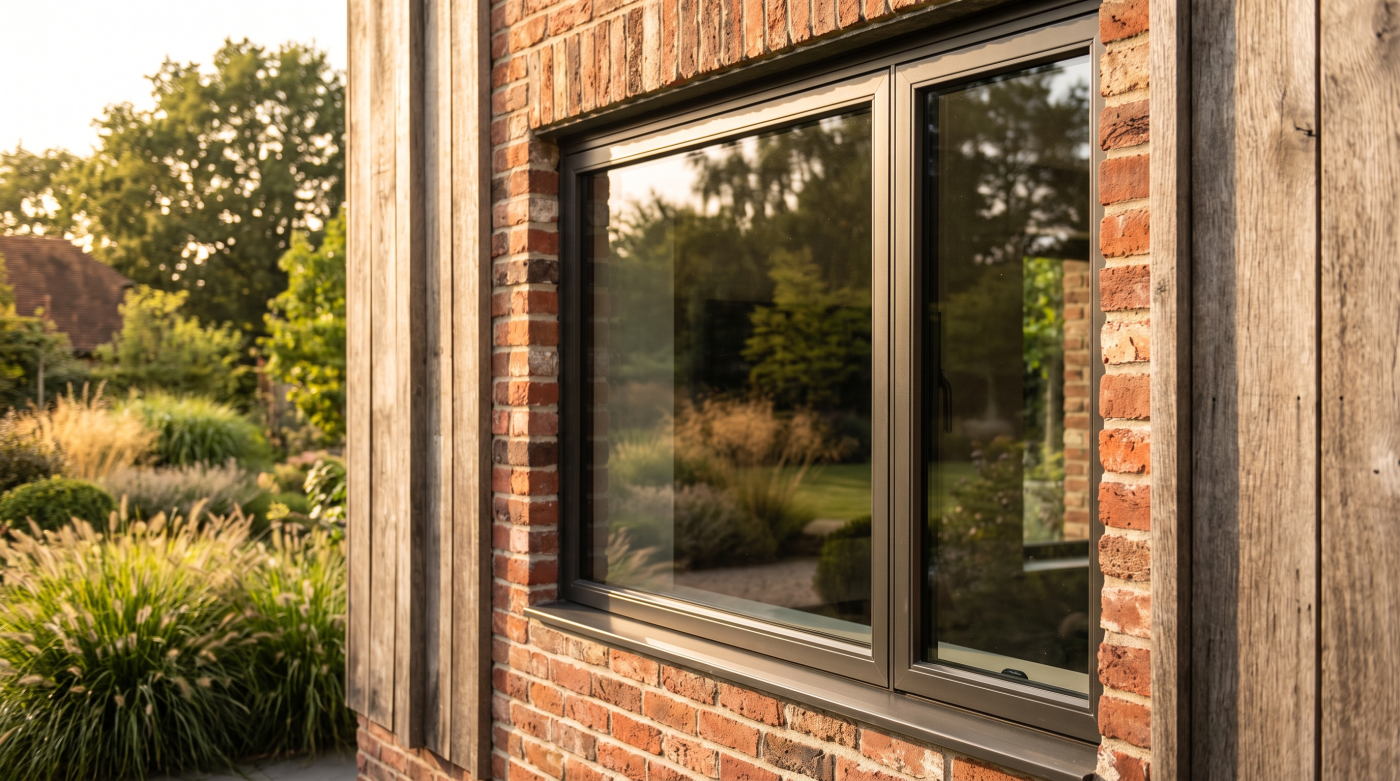
Bronze-like finishes and other warmer metallic tones can establish a quieter relationship with materials such as timber, limestone and brick. Instead of drawing a hard line around the glass, the frame can participate more subtly in the overall composition.
This is particularly relevant internally.
A room containing oak flooring, timber joinery, natural stone, warm-toned cabinetry or softer wall finishes may create a very different setting for the glazing than the cooler monochromatic interiors commonly associated with dark aluminium frames.
The objective should not be to make everything match.
In fact, exact matching can flatten a material palette.
More useful is the idea of relationship.
The glazing finish might pick up some of the warmth found elsewhere without attempting to imitate another material. It can complement timber without pretending to be timber, or sit comfortably beside stone without trying to disappear into it.
That distinction allows contemporary architecture to remain minimal while becoming materially richer.
Minimalism does not have to mean black, white and grey.
Nor does warmth require ornament, traditional detailing or visual complexity.
A large, highly restrained glazed opening can remain every bit as precise while using a finish with more warmth and tonal depth.
That broader architectural change helps explain why bronze is attracting attention now.
Warmer glazing is not appearing because architects suddenly decided that anthracite was wrong.
It is appearing because the material vocabulary around the window has become broader.
And as architecture becomes warmer, the glazing palette has room to become warmer with it.
Anthracite Still Works—When the Architecture Needs Contrast
The emergence of warmer metals does not make anthracite obsolete.
There are buildings where a strong dark frame remains exactly the right architectural decision.
Anthracite became so widely used partly because it performs a particular visual role extremely well. Against pale render, light masonry or natural stone, it can create a crisp edge around an opening. Within a strongly geometric elevation, dark frames can reinforce rhythm and definition. Where roofs, cladding, metalwork or other architectural elements are similarly dark, the glazing can form part of a coherent wider composition.
In those circumstances, contrast is intentional.
And contrast is not something architecture needs to move beyond simply because warmer palettes are attracting more attention.
The danger comes when anthracite is selected without establishing whether that contrast is actually wanted.
On one project, a dark frame might sharpen the relationship between a contemporary extension and an existing building. On another, the same finish could introduce a visual outline that competes unnecessarily with stone, timber or landscape.
That is why the decision should begin with the role of the frame rather than the popularity of the colour.
Does the architecture need the opening to be clearly defined?
Should the frame connect with other dark elements?
Would a stronger outline improve the composition?
Should the glazing visually recede into the darker appearance of the glass?
If so, anthracite may remain an entirely convincing answer.
This also prevents the move towards warmer metals becoming another form of trend-following.
Choosing bronze simply because it currently feels less familiar is no more architecturally rigorous than choosing anthracite because it feels safely contemporary.
Both finishes need a reason to be there.
A mature material palette can contain warmth and contrast simultaneously. Natural stone does not automatically require a warm frame. Timber does not automatically rule out dark aluminium. Sometimes the tension between materials is precisely what gives an elevation its character.
The objective is not to eliminate anthracite.
It is to restore intent to the decision.
Anthracite should survive as an architectural choice even if it declines as an automatic one.
Bronze Changes Character Depending on What Surrounds It
One of the difficulties with talking about bronze glazing is that there is no single visual experience called “bronze.”
A warmer metallic frame can appear restrained in one setting and surprisingly prominent in another. Its character depends not only on the finish itself, but on the light, glass, texture and materials surrounding it.
That makes comparisons based on colour names alone particularly limited.
Placed beside warm natural stone, a bronze-like finish may establish a softer relationship than a conventional dark grey. Rather than creating a strong outline around the opening, the frame can become another tone within a layered material palette.
Against timber, the relationship changes again.
The objective does not need to be matching the timber colour. A warmer metal can acknowledge some of the same underlying warmth while remaining clearly identifiable as a different material. That distinction can create richness without making the palette feel overly coordinated.
Brick introduces another set of possibilities. Depending on the brick and the particular finish, warmer framing may pick up earthy or muted tones that conventional black would deliberately contrast against.
Even render changes the way bronze is perceived. Against a pale surface, the frame may still provide clear definition, but potentially without the same graphic intensity associated with black.
None of these relationships makes bronze inherently better.
They demonstrate why the finish cannot be evaluated independently from the architecture.
Light matters too.
A nuanced metallic surface may appear different according to orientation, daylight conditions and viewing angle. The relationship between frame and glass can also change as reflections move across the elevation throughout the day.
This is why the word bronze should be treated as the beginning of a finish conversation rather than the end of one.
Different manufacturers and glazing systems may offer very different finishes under broadly similar descriptions. Actual availability, appearance, surface characteristics and manufacturer requirements should therefore be established from verified product information and appropriate samples.
The architectural decision happens when that real finish is considered beside the materials it will actually meet.
Stone. Timber. Brick. Render. Glass. Interior finishes.
A small sample viewed alone can tell you what the frame looks like.
It cannot fully tell you what the frame will look like as part of the building.
That distinction becomes increasingly important as glazing finishes become more nuanced.
Bronze should not be judged as a colour chip. It should be judged as one material within a complete architectural palette.
Bath Stone and Cotswold Limestone Make Warmer Metals Particularly Interesting
The relationship between glazing and natural stone makes the move towards warmer metals especially relevant in Bath and the Cotswolds.
Both Bath stone and Cotswold limestone bring their own colour, texture and natural variation to a building. The window frame therefore becomes one material within an already expressive architectural palette.
For years, dark aluminium has provided a familiar way of handling that relationship.
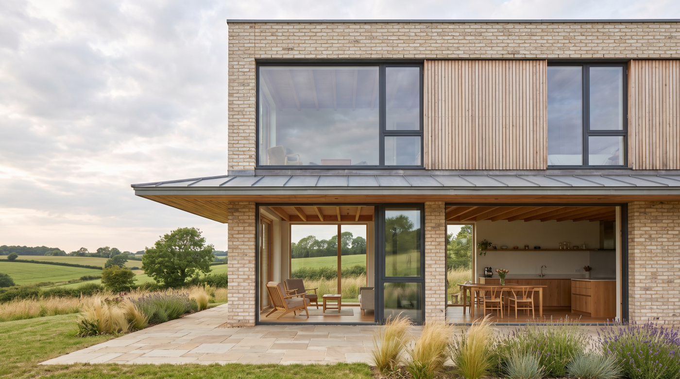
Against warm, pale stone, anthracite or black can create a crisp contemporary contrast. The opening becomes clearly defined, and the distinction between glazing and masonry is deliberately visible.
That can be extremely successful.
But it is not the only possible relationship.
Bronze-like and other warmer finishes introduce the possibility of greater tonal connection. Instead of placing a dark graphic line against the stone, the frame can sit closer to the warmth already present within the masonry.
The difference is subtle but architecturally significant.
A useful question is whether the design wants contrast or integration.
In Bath, a contemporary glazed intervention might intentionally distinguish itself from the surrounding stone architecture. A darker frame could reinforce that distinction.
Another project might seek a quieter relationship, allowing the stone to remain visually dominant while the glazing sits more gently within the material composition.
The same judgement applies in the Cotswolds.
A contemporary house using limestone and large areas of glass may benefit from strong dark framing where the architecture is deliberately graphic. A more landscape-led project could potentially use warmer tones to create greater continuity between stone, timber, glazing and the surrounding setting.
Neither approach is inherently more sophisticated.
What matters is that the relationship is deliberate.
This is also why isolated colour samples become less useful on projects where natural materials play a significant role. Stone itself varies. Light changes its appearance. Glass reflects the landscape and sky. Timber and other materials may weather over time.
Where practical, glazing finishes should therefore be considered alongside representative samples of the materials they will actually meet.
The question is not simply:
“Does this bronze look good?”
It is:
“What happens when this bronze sits beside this stone, this glass and this architecture?”
That is a much more meaningful test.
Bath stone and Cotswold limestone do not dictate which window-frame colour should be selected.
But they deserve to influence the decision.
In stone architecture, the frame is not simply the border around the glass. It is another material in the building.
Bronze Can Be Even More Important From Inside the House
From the street or garden, the window frame forms part of the elevation.
From inside the house, it becomes part of the room.
That distinction becomes increasingly important as glazing gets larger. A substantial sliding door, picture window or glazed elevation can occupy a significant proportion of the visual field within a living space. The frame is no longer a small perimeter detail. It sits alongside flooring, cabinetry, joinery, stone, furniture, lighting and other materials that may have been selected with considerable care.
This is where warmer metallic finishes can behave very differently from black or anthracite.
A dark frame can create a strong outline around the glass. Where the view is important, that can be highly effective—the frame almost acts as a deliberate border between the interior and the landscape beyond.
But not every room benefits from that degree of definition.
In an interior built around oak, natural stone, warm neutrals or softer finishes, a bronze-like frame may establish a quieter relationship with the materials around it. Rather than reading as a contrasting line at the edge of the room, it can become another element within the wider palette.
The question becomes:
Should the frame outline the view, or should it belong more quietly to the room?
Neither answer is universally correct.
A dramatic landscape may benefit from strong framing. A highly restrained interior may deliberately use dark window frames alongside lighting, ironmongery or other metalwork. Elsewhere, the objective may be to reduce contrast and allow materials to transition more gently towards the glass.
This is also why glazing finishes deserve consideration earlier in the interior-design process.
If substantial glazing has already been specified in a particular finish before flooring, kitchens, joinery and other materials are developed, the interior palette may effectively inherit a decision made primarily from the external elevation.
On design-led projects, architect, interior designer and glazing specialist can each contribute to that conversation.
The architect considers the complete building and elevation. The interior designer considers the material experience from within. The glazing specialist can establish which finish possibilities are genuinely available within the systems being considered.
Where different internal and external finishes are required, actual system capabilities should always be confirmed from verified manufacturer information rather than assumed.
The principle remains simple:
The larger the glazing becomes, the less sensible it is to treat frame colour as an exterior-only decision.
A window belongs to two environments at once.
The strongest finish decisions respect both.
Samples Matter More When Finishes Become More Nuanced
The broader the glazing palette becomes, the less useful it is to choose a finish from a screen, brochure or colour name alone.
That is particularly true with bronze and other warmer metallic finishes.
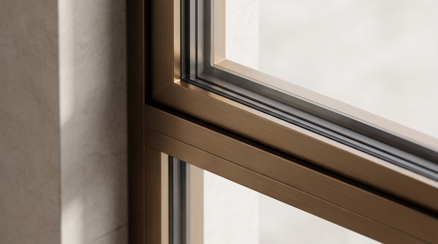
Subtle finishes are experienced through surface, light and context—not simply colour.
A photograph can suggest whether a frame is broadly dark, warm or metallic, but it cannot always communicate how that surface will behave on the building.
Natural daylight can change its character.
Morning and evening light may reveal warmth that appears much less obvious under artificial lighting. Orientation can affect how frequently the frame sits in direct light or shade. Surface texture and viewing angle can influence whether the finish appears relatively flat, deep or reflective.
Then there are the surrounding materials.
Place the same sample beside pale limestone and it may appear comparatively dark.
Move it beside rich timber and the relationship can become much warmer.
Against brick, render or a different stone, the visual balance changes again.
Even the glass matters. Reflections of sky, planting and surrounding architecture continually alter what sits immediately beside the frame.
This makes physical samples particularly valuable where appropriate manufacturer samples are available.
But simply looking at a sample on a desk is only the beginning.
Where practical, it is more useful to consider the glazing finish alongside representative materials from the project:
- Stone
- Brick
- Timber
- Render
- Flooring
- Joinery
- Other architectural metalwork
For a major glazed elevation, viewing those relationships in relevant natural light can reveal far more than selecting a finish from an online image.
This is also where terminology can become misleading.
“Bronze” may sound like a precise specification, but in practice it can describe a broad family of appearances. Different glazing systems and manufacturers may offer finishes with significantly different tones, textures and surface characteristics.
Actual availability and finish characteristics therefore need to be established from verified manufacturer information and samples rather than assumed from the colour name.
The more nuanced the finish, the more important this becomes.
With conventional black, the design intention may be relatively straightforward: create a strong dark frame.
With a warmer metallic finish, subtle differences can be central to why it was selected in the first place.
Colour names simplify specification. Buildings experience actual surfaces.
For bronze, anthracite or any other architectural finish, the most useful question is not what the sample is called.
It is what that surface does when it meets the rest of the building.
The Future Is a Material Palette, Not a Favourite Window Colour
Are bronze and warmer metallic finishes replacing anthracite?
On some projects, they may provide an increasingly compelling alternative. But focusing only on which colour comes next risks missing the more important change.
Premium glazing does not need another default finish.
For years, anthracite offered a straightforward answer to the question of how contemporary windows and doors should look. Its familiarity made specification easier, but it also encouraged frame colour to become something that could be decided almost independently from the rest of the building.
A more considered approach starts elsewhere.
Look at the architecture.
Look at the stone, brick, timber or render surrounding the openings.
Look at the landscape beyond the glass.
Look at the flooring, cabinetry, joinery and other materials experienced from inside.
Then decide what role the frame should play within those relationships.
A bronze-like finish may provide warmth and material depth.
Anthracite may provide exactly the contrast and definition the elevation requires.
A softer neutral or another darker finish may prove more convincing again.
The sophistication is not contained within the colour itself.
It lies in why that colour was selected.
This matters particularly on premium residential projects because glazing can occupy such a significant proportion of the architecture. Large sliding systems, picture windows and glazed elevations are not minor decorative components. Their frames become recurring lines throughout the building, experienced from both inside and outside.
Treating those frames as part of the material palette therefore makes more sense than selecting a favourite window colour and applying it everywhere.
It also changes the conversation around trends.
A trend asks which finish will become popular next.
Architecture asks whether the finish establishes the right relationship with everything around it.
The second question has much greater longevity.
A bronze frame chosen simply because bronze feels current today may eventually suffer exactly the same problem as anthracite selected simply because anthracite felt contemporary.
But a bronze finish selected because it works with the limestone, timber, interior palette and character of a particular home has an architectural reason to remain there.
That distinction is what matters.
Bronze does not need to become the new anthracite.
The more interesting change is that there may no longer need to be a “new anthracite” at all.