
Where the Green Colour in Glass Comes From
Glass is transparent, but that does not mean it is completely colourless. Standard clear architectural glass naturally has a subtle green appearance, and the main reason is the small amount of iron present within the raw materials used to manufacture it.
For most conventional windows, this colour can be difficult to notice. Looking directly through a relatively thin pane, particularly towards an outdoor view, the glass may appear almost entirely clear. But the green characteristic is still there. It becomes much easier to see when light travels through a greater thickness of glass.
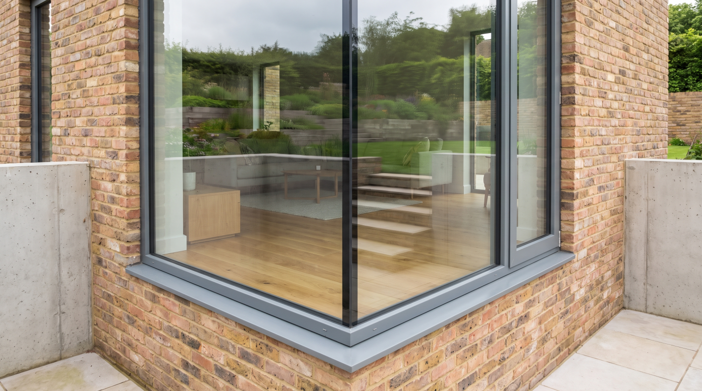
This is why the edge of a pane provides such a familiar example. Instead of looking through the relatively short distance between the two faces of the glass, you are effectively looking through considerably more material. The green colour consequently becomes much more pronounced.
The same principle helps explain why glass colour becomes increasingly relevant in architectural glazing. Larger and more sophisticated glazing can involve thicker panes, multiple layers or more complex glass build-ups. As the amount of glass through which light travels changes, characteristics that were almost invisible in a small conventional window can become more apparent.
It is important to recognise that this green appearance is not normally a defect. It is an inherent characteristic of standard clear glass. Different glass products and manufacturing specifications can vary, so the appearance of a proposed pane should ultimately be judged from appropriate product information and samples where visual neutrality is important.
The distinction is really between transparency and colour neutrality.
Standard clear glass can be highly transparent while still having a subtle colour of its own. Once that distinction is understood, it becomes much easier to explain why two panes described as “clear glass” may not necessarily look equally colourless.
Why Thickness Makes the Colour More Obvious
The green characteristic of standard clear glass becomes more noticeable as the distance light travels through the material increases. This is why a pane can appear almost colourless when viewed straight through its face, yet show a much stronger green tone when viewed along an exposed edge.
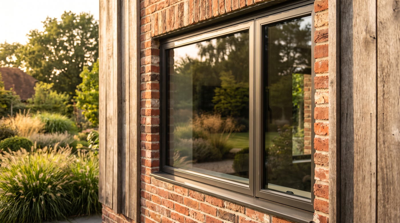
Thickness therefore matters. As the glass becomes more substantial, there is simply more material influencing the light passing through it. The effect can become particularly obvious at polished or exposed edges, where the viewing path through the glass is much longer than it is from one face of the pane to the other.
Architectural glazing can make this increasingly relevant because the finished glass is rarely just one simple sheet. An insulated glazing unit contains multiple panes, while laminated glass contains two or more glass plies bonded together. Depending on the design requirements, large-format glazing may also require more substantial glass constructions than those encountered in smaller conventional windows.
The visual result therefore needs to be considered as a complete build-up. A double- or triple-glazed unit, a laminated construction and a large structural glass detail may all contain different quantities and arrangements of glass, even though the finished surfaces appear simply as transparent panes.
This does not mean every large or thick glazing unit will suddenly appear obviously green. How noticeable the colour becomes depends on the particular glass, build-up, viewing conditions and what is being seen through or reflected by it. But as glazing becomes larger and more architecturally dominant, subtle material characteristics become harder to dismiss as insignificant.
The glass has not become green because the architecture became more ambitious. The architecture has simply made an existing characteristic of the material easier to see.
That is why glass thickness and build-up matter visually as well as technically—particularly when the design intention is for several metres of glazing to appear as neutral and unobtrusive as possible.
What Low-Iron Glass Actually Changes
Low-iron glass is designed to address the green characteristic found in standard clear glass. As the name suggests, it is manufactured with a lower iron content, reducing one of the principal causes of that familiar green tint and producing glass that appears more colour-neutral.
The difference can be particularly obvious at the edge. Standard clear glass often reveals a distinct green colour when viewed through its thickness, while low-iron glass can appear significantly clearer. Across substantial architectural glazing, that increased neutrality can also influence how naturally colours are perceived through the pane.
This can matter when the glazing is framing something the architecture deliberately wants to preserve visually. A landscape, pale stone terrace, rendered courtyard or carefully controlled interior palette may all be viewed through several layers of glass. Reducing the colour introduced by the glass itself can allow those materials and views to appear closer to their natural tones.
Low-iron glass should not, however, be understood as perfectly colourless or invisible. Glass remains a physical material that reflects, absorbs and transmits light, and its appearance changes according to lighting conditions, viewing angle and the complete glazing construction.
It is also important to understand what low-iron does not describe. Low-iron is essentially a choice about the base glass; it is not a complete performance specification. The finished glazing may still require low-E coatings, solar-control characteristics, lamination, toughening or other elements depending on what the project requires.
Those additional components can themselves influence the appearance and performance of the finished unit. Choosing low-iron base glass therefore does not guarantee that every completed glazing specification will look identical or completely neutral.
Its purpose is more specific: reduce the inherent green cast associated with conventional clear glass.
Where visual clarity is important, that relatively simple change in the base material can become surprisingly significant—particularly when the architectural intention is for the glass itself to disappear and the view beyond it to take priority.
When Low-Iron Glass Makes the Biggest Visual Difference
Low-iron glass does not create the same degree of visual benefit in every application. Its value becomes greatest when the architecture places particular importance on transparency, colour neutrality or the ability of the glazing to visually disappear.
Large picture windows are a clear example. When a pane has been designed specifically to frame a landscape, the glass sits directly between the occupant and the view the architecture is trying to celebrate. Across a substantial area, reducing the green cast associated with standard clear glass can help colours beyond the glazing appear more neutral.
The same consideration applies to minimal-frame sliding doors. As frames become slimmer and panes become larger, glass increasingly dominates the elevation. The visual quality of the glass itself therefore becomes more significant. If the objective is to create the impression of an almost uninterrupted opening onto the landscape, greater colour neutrality may support that architectural intention.
Glass-to-glass corners and other details with exposed edges can make the difference particularly noticeable. The natural green colour of standard glass is often strongest when viewed through its thickness, so reducing that colour can have considerable visual value where the architecture deliberately exposes or celebrates the edge of the material.
Interior design can influence the decision too. Pale stone, white surfaces, neutral finishes, artwork and carefully controlled material palettes may make subtle colour shifts through the glazing easier to perceive. Where accurate colour representation forms an important part of the visual experience, clearer base glass can become more valuable.
That does not mean every window in a premium home automatically needs low-iron glass. Smaller openings, secondary spaces or panes where the visual difference is unlikely to influence the architecture may present a weaker case for the additional specification. The benefit should be considered against the location, view, complete glass build-up and project priorities.
Low-iron glass is most valuable when clarity itself is part of the design brief.
The more the architecture is trying to make the glazing disappear, the stronger the case becomes for considering how much colour the glass itself introduces.
Coatings Can Change What “Clear” Looks Like Again
Choosing low-iron glass can reduce the natural green cast of the base material, but that does not mean the finished glazing unit will be completely colour-neutral. Modern architectural glass is often required to do considerably more than provide transparency, and the coatings and additional layers used to achieve that performance can influence how the completed glass looks.
Low-E coatings are one example. They are used to help improve thermal performance, but different coating specifications can introduce subtle differences in colour and reflectivity. Solar-control coatings can have their own visual characteristics as well, particularly where the glass is being designed to manage a greater proportion of incoming solar energy.
Laminated constructions introduce additional layers, while double and triple glazing contain multiple panes and surfaces. The finished appearance is therefore the result of the complete glass build-up rather than simply whether the original base glass was standard clear or low-iron.
This is why two glazing specifications described casually as “clear glass” may not look identical when installed beside one another. One may use a different coating, another may be laminated, and another may have a different insulated glass construction. Each difference can subtly influence the way light is transmitted and reflected.
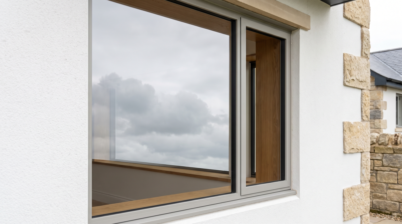
Viewing conditions complicate the picture further. Glass can appear different from inside and outside, and its reflectivity and apparent colour can change according to the sky, surrounding landscape, interior lighting and viewing angle. A large pane reflecting a blue sky may naturally appear very different from the same specification viewed on an overcast day.
Low-iron glass therefore solves one specific visual issue: it reduces the green cast associated with the iron content of conventional clear glass. It does not remove every other optical characteristic introduced by the finished glazing specification.
This is why performance and appearance need to be considered together. The glass may need low-E performance, solar control, lamination or other characteristics, but those decisions should also be understood as part of the architectural material selection.
The base glass establishes the starting point. The complete build-up determines what the finished glazing actually looks like.
Why Matching Glass Across an Elevation Matters
A subtle difference between two glass specifications can be difficult to notice when the panes are viewed separately. Put them directly beside one another, however, and that difference can become much easier to see. This is why glass appearance should be coordinated across an architectural elevation rather than considered one opening at a time.
Large glazed elevations often contain several different components. A sliding door may sit beside a fixed pane, a structural corner may connect two elevations, or one section of glazing may require a different glass build-up because of its size, location or performance requirements. Although the architectural intention may be for all of those panes to read as one continuous transparent surface, their technical specifications may not necessarily be identical.
Differences in base glass, coatings, lamination and the complete insulated glass build-up can all influence colour and reflectivity. If one pane uses standard clear glass and another uses low-iron, or if adjacent units require different performance coatings, the visual relationship between them needs to be considered rather than assuming that the word “clear” guarantees a perfect match.
Replacement glazing presents a similar challenge. Glass manufactured at a different time or to a different specification may not visually match an existing pane exactly. This becomes particularly important where a replacement sits immediately alongside the original glazing, because the eye has a direct reference against which to compare it.
There may also be legitimate reasons for using different performance specifications on different parts of a building. Solar exposure, safety requirements or other design considerations can vary by location. The objective is not necessarily to force every pane into an identical specification, but to understand whether those differences could create an unintended visual effect.
For this reason, the glass schedule should be considered as part of the architectural composition. Where visual consistency is particularly important, the proposed specifications should be reviewed using verified product information and appropriate samples rather than relying solely on generic descriptions.
A slight difference in glass colour may be almost invisible on its own.
Place two large panes side by side and the comparison can make that difference immediately apparent.
When glazing forms a continuous elevation, matching the glass is therefore not simply a product-detail exercise. It is part of preserving the visual coherence of the architecture.
Is Low-Iron Glass Worth the Extra Cost?
Low-iron glass can carry a premium over standard clear glass, which leads to an obvious question: is the visual improvement worth paying for?
There is no universal answer because the value depends heavily on where the glass is being used. If a small secondary window has no exposed edges and does not frame an important view, reducing the natural green cast may make relatively little difference to the architectural experience. On a substantial picture window overlooking a landscape, the same decision can become much more significant.
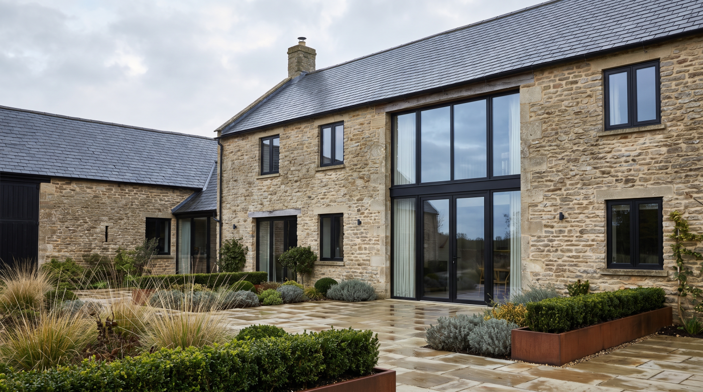
Minimal-frame glazing strengthens that case. When several metres of glass dominate an elevation and the design intention is to make the boundary between inside and outside feel as unobtrusive as possible, the optical quality of the glass becomes part of the architecture. Greater colour neutrality can support the very reason such an ambitious glazing system was specified in the first place.
Exposed edges and glass-to-glass junctions are another consideration. Because the green characteristic of standard clear glass becomes particularly noticeable when viewed through its thickness, low-iron glass can produce a much more obvious visual difference in details where those edges remain visible.
This does not mean low-iron should automatically be specified throughout an entire house. There may be opportunities to prioritise it where greater clarity creates the most architectural value, provided the visual relationship between different glass specifications has been properly considered. Adjacent panes need particular care because even subtle differences can become more noticeable when viewed directly alongside one another.
The financial premium itself cannot usefully be expressed as a generic percentage. Glass dimensions, processing, coatings, lamination and the complete insulated glass build-up can all influence project pricing. The meaningful comparison therefore needs to come from the actual proposed specifications and verified quotations.
Where appearance matters, physical samples can also help inform the decision. They will not reproduce every lighting and viewing condition of the finished building, but they can provide a more useful reference than judging glass solely from photographs or technical descriptions.
Low-iron glass should not be treated as a badge of premium specification.
Its value comes from whether greater visual neutrality materially improves the architecture.
If the glass exists primarily to reveal an exceptional view, reducing the colour introduced by the glass itself may be money well spent. If the visual difference contributes little to a particular opening, that investment may be better prioritised elsewhere.
Choose Glass by Looking Through It, Not Just at the Datasheet
Architectural glass has to satisfy a growing list of requirements. It may need to provide thermal insulation, manage solar gain, meet safety requirements and work within the structural limitations of the glazing system. All of those characteristics matter, but there is another part of the specification that is much easier to overlook: what the glass actually looks like.
The starting point should be the architectural objective. Is the glazing intended to frame a landscape as naturally as possible? Is visual neutrality particularly important? Are exposed glass edges part of the detail? Or is a degree of reflectivity acceptable within the architectural language of the building?
Those questions can help determine whether standard clear or low-iron base glass deserves consideration. From there, the other requirements of the glazing need to be added. Low-E coatings, solar-control characteristics, lamination and the complete insulated glass construction can all influence the appearance of the finished unit, so the base glass should never be considered in isolation.
Consistency across the elevation matters too. Fixed panes, sliding panels and other glazed elements may require different technical constructions, but they often need to appear as one coherent architectural composition. Any differences in glass specification should therefore be considered visually as well as technically.
Datasheets remain essential. Verified information tells the design team how the proposed glass performs and allows meaningful comparison between specifications. But numbers cannot communicate every aspect of how several metres of glazing will look against a particular landscape, material palette or changing sky.
Where visual neutrality is especially important, appropriate physical samples can provide another useful reference. Even these have limitations—the appearance of installed glass will change with scale, lighting, reflections and viewing angle—but they can help make subtle differences between specifications more tangible.
The final decision is therefore a balance. Greater clarity may justify additional investment on the project’s defining view while offering relatively little benefit elsewhere. Thermal, solar and safety requirements may also influence which visual options are realistically available.
The objective is not to specify the clearest glass at any cost. It is to select glass whose visual character supports the architecture while still delivering the performance the building requires.
Because ultimately, architectural glazing is not experienced as a collection of numbers on a datasheet.
It is experienced by looking through it.