
How Black Became the Language of Contemporary Glazing
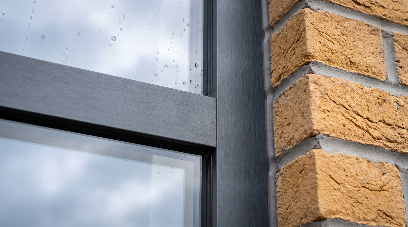
Black and very dark window frames did not become dominant in contemporary residential architecture by accident. They became popular because they solved several visual problems extremely well.
Against large areas of glass, a dark frame can appear relatively recessive, allowing the view or opening to carry more visual weight. Against pale render, natural stone or lighter masonry, the same frame can create deliberate contrast and give an elevation stronger definition.
Dark aluminium also fitted naturally with the architectural language developing around contemporary extensions and new homes: restrained material palettes, large openings, cleaner lines and increasingly minimal detailing.
Over time, that aesthetic acquired another meaning.
Black became shorthand for contemporary.
Then, increasingly:
Black became shorthand for premium.
Architectural photography helped accelerate the association. Dark frames reproduce strongly in photographs, creating crisp outlines around glazing and clear contrast against stone, render, timber and landscape. As those projects appeared across magazines, manufacturer imagery, social media and property marketing, the look became increasingly familiar.
Homeowners saw architect-designed houses with black frames.
They saved them.
They referenced them during their own projects.
Manufacturers and suppliers showed more of them.
And gradually, a deliberate architectural choice became something much closer to a default specification.
The progression looked something like:
Architectural solution → Premium association → Wider adoption → Default choice
That history matters because it would be too simplistic to dismiss black frames as merely a fashion that has run its course.
They became popular for good reasons.
On the right building, dark frames can still provide exactly the contrast, definition or visual restraint the architecture requires.
The more interesting question is what happens once a design choice becomes so widespread that it is selected before anyone asks whether the building actually needs it.
That is where the black-frame conversation is changing.
Black did not become the default because architects made a mistake. It became the default because it worked so well that eventually almost everyone started using it.
When an Architectural Choice Becomes a Default Specification
The problem with black frames is not that they suddenly stopped working.
The problem begins when nobody asks why they are being specified.
A finish that once represented a deliberate architectural decision can gradually become a convention. Black and anthracite frames now appear across contemporary new builds, extensions, rural renovations, developer housing, period properties and relatively straightforward replacement projects.
The same colour is being asked to perform in very different architectural contexts.
That ubiquity changes its meaning.
What once communicated a distinctly contemporary approach can eventually become the safe option—the colour selected because it feels familiar, premium and difficult to object to.
The design process can then become strangely inverted.
Instead of:
Architecture → Materials → Frame role → Colour
it becomes:
Anthracite frames → Now make everything else work with them
That is a subtle but important shift.
Before selecting a dark finish, it is worth asking what the frame is supposed to contribute to the building.
Should it create contrast?
Should it visually recede against the glass?
Should it connect with roofing, metalwork or other architectural elements?
Should it provide a strong outline around an opening?
Or would the architecture benefit from the frame having much less visual presence?
The answers may differ between projects—and potentially even between the internal and external experience of the same window.
This is particularly important when glazing sits alongside materials with strong character of their own. Natural stone, timber, brick and softer interior palettes do not automatically need a black line drawn around every opening.
Sometimes that contrast is exactly what makes the composition successful.
Sometimes it is simply what has become conventional.
That distinction is where architectural judgement matters.
The question therefore should not be:
“Are black windows still fashionable?”
It should be:
“What does a black frame contribute to this particular building?”
If there is a convincing answer, black may remain entirely appropriate.
If the only answer is because that’s what contemporary windows normally look like, it may be worth investigating further.
Black frames are not the problem. Automatic black is.
Are Black Windows Actually Going Out of Style?
Ask whether black windows are going out of style and it is tempting to answer with another trend prediction:
Black is out. Something else is in.
The reality is more nuanced.
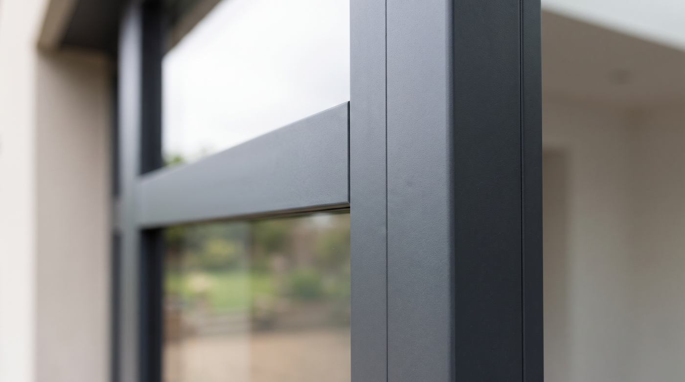
Black and very dark window frames are unlikely to disappear from residential architecture. They remain extremely effective where the design calls for strong contrast, graphic definition or a frame that visually recedes against large areas of glass.
What may be changing is something more significant:
Black is becoming less automatic.
For years, dark aluminium could almost function as a shortcut to a contemporary aesthetic. Pair large glazing with black or anthracite frames and the architectural language was immediately recognisable.
But once that combination becomes widespread, it inevitably loses some of its ability to distinguish a project.
That does not make the colour wrong.
It simply means the specification increasingly needs another reason behind it.
A dark frame can still work exceptionally well where it connects with roof detailing, metalwork or other elements of the elevation. It can create deliberate contrast against pale masonry or render. Around a significant view, it can provide a controlled outline—or visually disappear into the darker appearance of the glazing.
Those are architectural reasons.
“Black looks modern” is increasingly a weaker one.
This distinction matters because design trends rarely operate like switches. One colour does not suddenly become unfashionable on 31 December and get replaced by another the following year.
Instead, dominance gradually weakens.
Architects, interior designers and homeowners begin exploring a wider palette. Materials that previously would automatically have been paired with black start being considered alongside warmer, softer or more nuanced finishes.
The result is not necessarily the end of black glazing.
It is the end of assuming that contemporary glazing has to be black.
So, are black windows going out of style?
Not necessarily. But their position as the automatic premium choice is becoming harder to defend.
A mature design approach does not need to replace one universal default with another.
Black is not “out.” Automatic black is.
What Is Replacing Black? Probably Not One Colour
If black and anthracite are becoming less automatic, the obvious question is:
What replaces them?
The temptation is to nominate another finish and declare it the next dominant trend.
Bronze. Warm grey. Brown. Muted neutrals.
But that risks repeating exactly the process that made anthracite so ubiquitous in the first place.
If every project replaces anthracite with bronze, bronze simply becomes the next default.
The more interesting direction is towards a broader and more considered palette.
Softer dark tones can retain some of the definition associated with black without creating such a strong graphic outline. Warmer greys and earth-influenced colours can establish a different relationship with natural materials. Bronze-like and more nuanced metallic finishes can introduce warmth where conventional black might feel comparatively stark.
These approaches can become particularly relevant alongside materials such as natural stone, timber and brick, or within interiors built around warmer and more tactile palettes.
But none should be considered universally better.
The shift is less:
Black → New fashionable colour
and more:
Default colour → Context-led finish
That changes the specification question completely.
Instead of asking which colour is currently replacing anthracite, ask what relationship the frame should have with the materials around it.
Should it contrast?
Should it recede?
Should it relate tonally to the masonry?
Should it connect with timber, metalwork or interior finishes?
Should the frame be clearly visible—or should attention remain on the glass, view and architecture?
Once those questions are answered, the appropriate finish becomes easier to investigate.
This is a more durable approach because it does not depend on predicting which colour will dominate architectural photography over the next few years.
It gives the colour an architectural reason to exist.
The real successor to black may not be bronze, beige, brown or another shade of grey.
It may simply be choice.
A broader willingness to select glazing finishes around the building rather than around the trend cycle.
Stone Changes the Colour Conversation
Frame colour becomes particularly interesting when contemporary glazing sits alongside natural stone.
Materials such as Bath stone and Cotswold limestone already have a strong visual character. Their colour, texture and natural variation contribute significantly to the identity of the building, which means the glazing frame does not exist against a neutral background.
It becomes part of a material relationship.
Dark frames can work extremely well in this context.
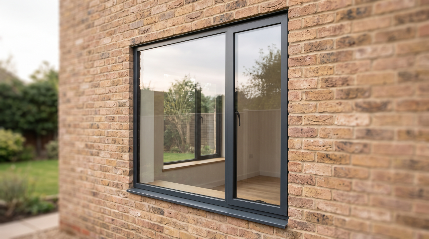
Against pale or warm stone, black or anthracite can create deliberate contrast, clearly defining the new glazing and giving the elevation a sharper contemporary edge. On a modern extension to an older property, that distinction between materials may be an intentional part of the architectural concept.
But contrast is only one approach.
A softer, warmer or more tonally related finish can create a very different effect. Rather than drawing a strong line around the opening, the frame may sit more quietly within the wider material palette.
The choice is therefore not:
Black or not black
but:
Contrast or integration?
Neither strategy is automatically better.
In Bath, for example, a contemporary intervention may intentionally establish a clear visual relationship between new glazing and existing stone architecture. Elsewhere, the design may call for something quieter that allows the masonry to remain dominant.
The same applies across the Cotswolds, where stone, landscape and contemporary glazing often meet within the same composition. A frame finish that works beautifully on a highly contrasting modern addition may feel unnecessarily severe on a building intended to settle more gently into its surroundings.
This is why selecting window colour from an isolated sample can be misleading.
The finish needs to be considered alongside the actual materials it will meet.
Stone → Frame → Glass → Surrounding architecture
And ideally, those relationships should be considered at a meaningful scale rather than assuming that a small colour swatch represents how an entire elevation will feel.
Black remains one possible answer.
It is simply no longer the only convincing one.
The frame colour should establish a relationship with the stone—not simply sit in front of it.
The Frame Has an Interior Life Too
Window-frame colour is often discussed as though it were purely an exterior decision.
Architectural elevations are reviewed. Stone, brick, render and roofing materials are compared. Samples are held against the outside of the building.
But once the project is complete, the homeowner will spend far more time looking at those frames from inside the house than standing outside studying the elevation.
That changes the colour conversation.
Internally, the frame becomes part of a different material palette:
Flooring → Joinery → Walls → Kitchen finishes → Metalwork → Furniture → Frame → View
A strong black frame can work beautifully within that composition. Around a significant landscape or garden view, it can create a deliberate outline—almost like a picture frame around what lies beyond the glass.
In a restrained contemporary interior, dark frames can also connect effectively with lighting, ironmongery, kitchen detailing or other darker elements.
But the same frame can become surprisingly dominant in an interior built around softer materials, pale timber, warm neutrals and quieter tonal relationships.
This is why choosing a frame colour entirely from the external elevation can miss half of the architectural problem.
The better question is:
What should the frame do when viewed from inside?
Should it disappear as much as possible?
Should it define the view?
Should it create deliberate contrast?
Or should it become another material within the interior palette?
Where a particular glazing system offers different internal and external finish possibilities, that may provide another avenue to investigate. Availability and finish options vary between manufacturers and systems, so these should be established from verified product information rather than assumed.
This is also why frame selection can benefit from collaboration between architect, interior designer and glazing specialist.
The architect considers the complete architectural composition.
The interior designer considers how the frame relates to the spaces and materials experienced from within.
The glazing specialist can provide relevant information about the finishes and system possibilities available.
Together, they can treat the window as what it actually is:
a boundary between two designed environments.
Because a window is simultaneously part of the elevation and part of the room.
Never choose its colour from the outside only.
Finish Longevity Matters More Than Trend Longevity
When choosing a window-frame colour, one question tends to dominate:
“Will this still look fashionable in ten years?”
It is a reasonable concern, particularly on a substantial renovation or new-build project where the glazing may remain in place for decades.
But it is not the only question worth asking.
A more useful test is:
“Will this finish still make sense on this building in ten years?”
Those are not quite the same thing.
Fashion changes independently of architecture. A particular colour may become less prominent in magazines and social media while continuing to look entirely appropriate on buildings where it has a clear relationship with the materials, proportions and wider design.
This is why context can provide a stronger foundation for longevity than trend forecasting.
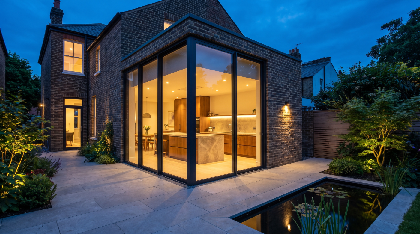
If a dark frame was selected because it creates deliberate contrast with pale stone, that relationship will still exist when fashions change. If a warmer finish was chosen because it connects naturally with timber, masonry and the interior palette, its justification does not disappear simply because another colour becomes fashionable.
The framework becomes:
Trend → Temporary popularity
versus:
Architecture → Material relationship → Long-term relevance
There is also a physical dimension to longevity.
Windows are expected to remain part of a building for a substantial period, so finish selection should not be considered purely aesthetically. Where relevant, manufacturer information should be consulted for available finishes, maintenance requirements, warranties and other system-specific considerations rather than assuming that every finish or coating performs identically.
It is also worth considering how the materials around the glazing may change.
Timber can weather. Stone can develop character. Interior schemes can evolve. Landscaping matures. A frame colour will gradually exist within a building that looks different from the day it was completed.
The strongest choices are therefore often those capable of belonging to that evolving material composition rather than depending on a very specific decorative moment.
You cannot guarantee that any colour will remain fashionable.
Nor do you need to.
A finish does not have to remain fashionable if it continues to belong to the architecture.
That is a more useful definition of longevity—and a much stronger basis for choosing glazing intended to remain in the building long after today’s colour trends have changed.
Choose the Frame From the Architecture Outward
If black is no longer the automatic answer, the solution is not to search for another automatic answer.
It is to change the way the colour decision is made.
A useful sequence is:
Architecture → Material → Landscape → Interior → Frame role → Finish
Start with the architecture.
Is the building deliberately contemporary, quietly contextual, strongly geometric or materially expressive? Is the glazing part of a new-build composition, a modern extension or an intervention within an older property?
Then consider the materials.
Stone, brick, timber, render, metal and roofing materials all create different relationships with a window frame. The finish should be considered as part of that complete palette rather than as an isolated product choice.
Next comes the landscape.
Some buildings benefit from deliberate contrast. Others are designed to sit more quietly within their surroundings. A frame that appears appropriate in an urban extension may behave very differently in a landscape-led rural home.
Then look inside.
Flooring, joinery, kitchens, wall finishes and other interior materials influence how the glazing is experienced from the room.
Only then ask what role the frame should play.
Should it:
Disappear?
Define?
Contrast?
Integrate?
Those four words can be more useful than starting with four colour samples.
Once the intended role is understood, actual finishes can be investigated against the glazing systems being considered, using verified manufacturer information to establish what is genuinely available.
This reverses a surprisingly common design process:
Favourite sample → Window colour → Whole house
and replaces it with:
Whole house → Architectural relationship → Appropriate finish
That distinction explains both why black became so successful and why the glazing palette may now be broadening.
Black frames suited the clean lines, strong contrasts and large areas of glass that became characteristic of contemporary residential architecture. They worked so effectively that a deliberate architectural solution gradually became a default aesthetic.
What replaces that default does not need to be bronze, warm grey, brown or any other supposedly fashionable successor.
It can be something much more useful:
judgement.
The question is no longer simply:
“Which window colour looks premium?”
It is:
“What should the frame contribute to this particular building?”
Sometimes the answer will still be black.
Sometimes it will not.
And that is the point.
Black frames are not becoming wrong. Choosing black without asking why is becoming harder to justify.