
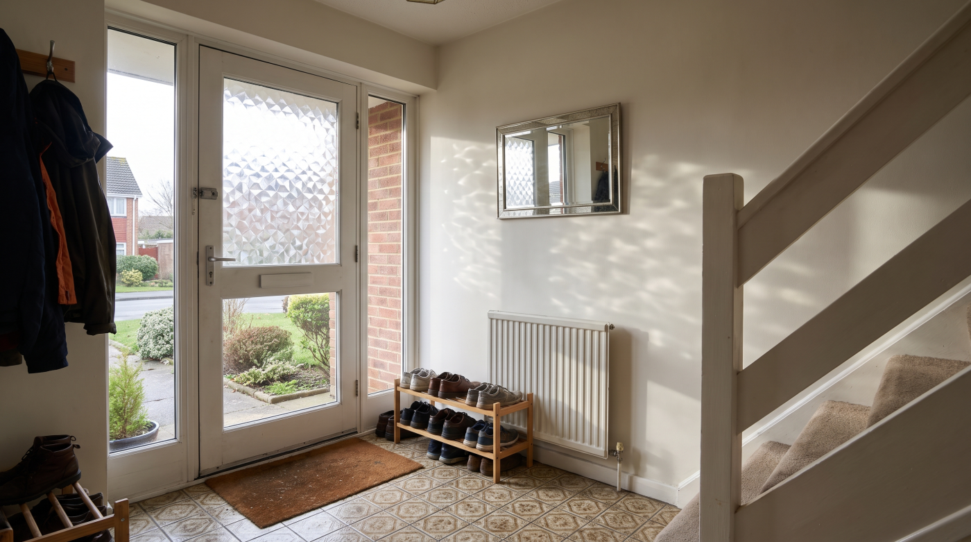
The Hall Is Not Just the Space Between Rooms
Entrance halls are easy to underestimate because they are rarely treated as destination spaces. They are passed through rather than occupied for long periods, and their floor area is usually modest compared with kitchens, living rooms or extensions. Yet architecturally, they do far more than simply connect one part of the house to another.
The hall establishes the first internal impression of the building. It reveals ceiling height, proportions, materials, light levels and the relationship between rooms. It also controls how the rest of the house unfolds. A well-considered entrance can make a modest plan feel ordered and generous, while a poorly resolved one can make even a substantial renovation feel compressed or fragmented.
Daylight has an especially strong influence. A side light beside the front door, a fanlight above it or a carefully positioned stair window can alter the perceived scale of the space far more effectively than decorative finishes alone. Light gives depth to walls, clarifies circulation and helps the eye understand where the house leads next.
This is why entrance halls should be treated as architectural rooms in their own right. They may not require the largest budget, but they often carry one of the greatest visual responsibilities.
The hall is not simply the space between rooms. It is the point at which the architecture introduces itself.
First Impressions Are Mostly About Proportion
The quality of an entrance is often attributed to materials: a substantial door, expensive hardware or carefully chosen finishes. Yet proportion usually has a greater influence on whether the composition feels convincing.
A front door that is too narrow for the elevation can make a generous façade feel strangely mean. Oversized framing can visually crowd an opening, while poorly proportioned sidelights or fanlights can make the entrance appear assembled from separate components rather than designed as one composition. These effects are subtle, but they are immediately legible.
The surrounding architecture provides the reference point. Ceiling height, façade width, window proportions and the scale of adjacent rooms all influence how an entrance should be resolved. A tall opening may suit a building with generous floor-to-ceiling heights, while a more restrained arrangement can feel entirely appropriate within a smaller period façade.
Glazing can help adjust this balance without making the entrance unnecessarily elaborate. Narrow sidelights can widen the perceived opening. A fanlight can add height and bring daylight deeper into the hall. The success of either depends on how naturally those elements sit within the elevation.
This is why expensive finishes cannot rescue weak proportions. The strongest entrances often feel quietly resolved rather than overtly luxurious. Their dimensions simply belong to the building.
When proportion is right, the entrance feels intentional before the eye has time to consider what any individual component cost.
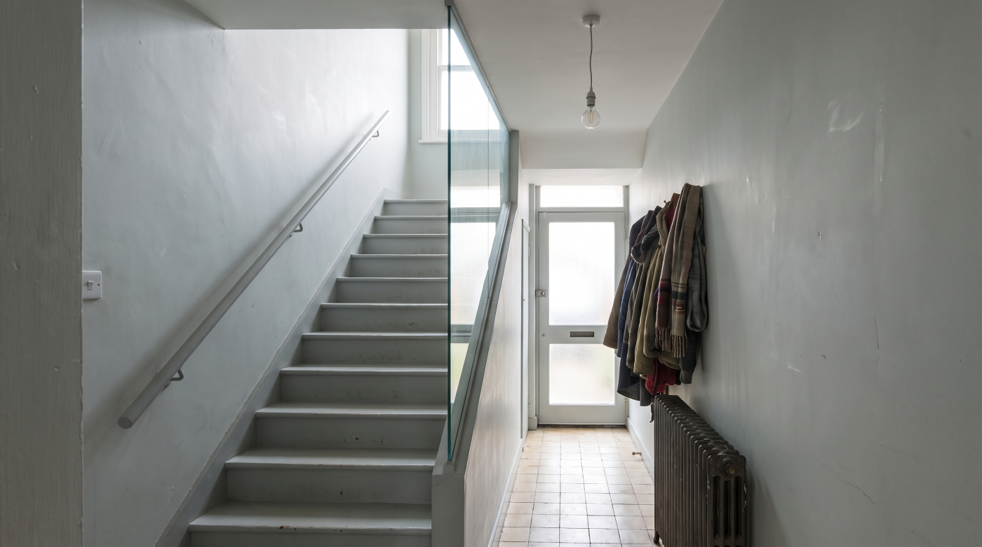
Daylight Changes How Small Spaces Feel
Small circulation spaces are often judged by their dimensions, yet the way they feel is shaped just as strongly by light. A narrow hallway with good daylight can appear calmer and more generous than a larger one that depends entirely on artificial illumination.
Entrance halls, landings and stairwells are particularly vulnerable because they frequently sit away from the main glazed elevations. Without carefully placed openings, they can become visually flat and disconnected from the rest of the house. This is where modest areas of glazing can have an unusually large effect.
A sidelight beside the front door can pull daylight across an entrance. A fanlight can illuminate the ceiling plane and increase the sense of height. Stairwell glazing can bring light through several levels at once, while internal glazed screens can borrow daylight from brighter adjoining rooms without removing spatial definition.
Privacy does not necessarily prevent this approach. Obscured, textured or carefully positioned glazing can admit light while limiting direct views, allowing the architecture to benefit without compromising the way the space is used.
The important point is that daylight alters perception. It reveals depth, strengthens material textures and makes circulation easier to read.
In compact spaces, adding floor area is often difficult and expensive. Introducing light, by contrast, can transform the experience without changing the footprint at all.
The Front Door Sets the Architectural Tone
The front door is one of the few elements of a house that is experienced both as part of the elevation and at close range. It has to work architecturally from the street, but it also becomes a tactile object through its material, weight, handle, glazing and threshold. That makes it unusually influential.
Problems begin when the door is treated as an isolated feature. A design chosen to make a statement can easily compete with the proportions, rhythm and material language of the façade around it. In some houses, particularly period properties, restraint can produce a far stronger result than visual complexity.
The relationship with surrounding glazing matters too. Sidelights, fanlights and nearby windows should feel as though they belong to the same composition. Their frame widths, alignments and proportions can either reinforce the entrance or make it appear fragmented.
Contemporary entrances face a similar challenge. Minimal detailing only works when the geometry is controlled carefully. A flush appearance, large leaf or narrow sightline can look effortless, but only if junctions, reveals and surrounding finishes support the idea.
The most successful front doors therefore do not simply attract attention. They establish tone. They suggest whether the architecture is formal, understated, traditional or contemporary before the visitor has stepped inside.
A strong entrance feels deliberate because every element appears to belong to the building, rather than having been added to it.
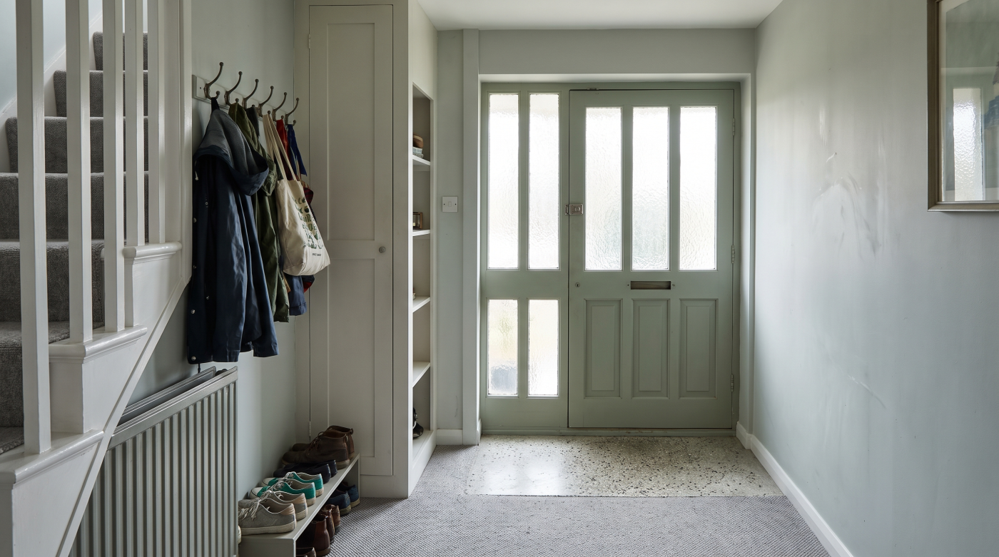
Stairwells Are an Opportunity Most Renovations Waste
Stairwells are often treated as purely functional parts of a house, yet they offer some of the strongest opportunities for architectural glazing. Because they connect multiple levels, even a relatively modest opening can influence more than one floor at once.
A tall window beside a stair can draw daylight deep into the plan and change the character of both the flight and the landing above. Roof glazing can introduce light from a direction that would otherwise be unavailable, while carefully positioned openings can frame views that reveal themselves gradually as someone moves through the house.
This makes stairwells particularly powerful in renovations where floor area is fixed. The architecture can feel transformed without extending the building simply by improving how light and views move through the existing volume.
There are practical considerations. Privacy may matter on street-facing elevations, while solar gain, cleaning access and the relationship with handrails or landings all need to be resolved carefully. Large areas of glazing may also require structural coordination, particularly where openings interrupt existing walls.
When handled well, however, the effect can be disproportionate to the intervention. A previously dark circulation route can become one of the most memorable parts of the home.
The stairwell is not merely a route between floors. It is a vertical room, and glazing gives it the potential to connect light, movement and architecture through the full height of the house.
What You See Through the Entrance Matters Too
An entrance is shaped not only by the door, hall or staircase, but by what the eye is allowed to see beyond them. The first view into a house can create a strong sense of depth, orientation and generosity long before the visitor reaches the principal rooms.
This is where internal sightlines become important. A clear visual connection from the front door towards a garden, courtyard or rear glazed opening can make the plan feel more coherent and expansive. Conversely, a poorly positioned partition, misaligned doorway or piece of joinery can interrupt that sequence and make the interior feel more fragmented than it really is.
Glazing often plays a decisive role. A rear elevation of glass may influence the experience of arrival from the opposite side of the house, drawing daylight through the plan and giving the entrance a visual destination. Internal glazed screens can achieve a similar effect where full openness is neither practical nor desirable.
The strongest results usually come from treating these views as part of the architecture rather than accidental glimpses. Alignment, proportion and the placement of openings all contribute to how the house is read in motion.
A compelling entrance therefore depends partly on what lies beyond it. The space feels more considered when arrival is connected to a wider sequence of rooms, light and views rather than ending at the first internal wall.
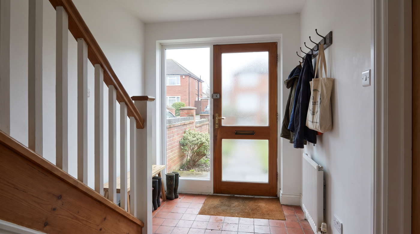
Small Specification Errors Become Surprisingly Obvious
Entrance halls and circulation spaces often contain fewer visual elements than kitchens or living rooms. That simplicity can make them feel elegant when the detailing is resolved well, but it also leaves very little room for weak junctions or misaligned components to hide.
A frame that sits awkwardly within a reveal, a threshold that interrupts an otherwise clean floor line or a side light that does not align comfortably with the door beside it can become disproportionately noticeable. The eye has fewer competing objects to distract it, so relatively small inconsistencies carry more visual weight.
This is especially true around front-facing glazing. The entrance is seen repeatedly, from both inside and outside, and it often sits within one of the most compositionally sensitive parts of the elevation. Small deviations in proportion, finish or alignment can therefore affect the perceived quality of the whole façade.
The surrounding finishes matter just as much. Plaster lines, skirting, flooring and external paving all meet the glazing somewhere, and those interfaces determine whether the result feels integrated or pieced together.
Good detailing is rarely about adding complexity. More often, it is about removing visual friction.
In compact architectural spaces, precision has unusual value. The fewer elements there are, the more clearly each one is judged. That is why seemingly minor specification errors can become some of the most visible details in the entire renovation.
Spend According to Visibility, Not Square Metres
Renovation budgets are often allocated according to room size or perceived importance. Kitchens receive large sums because they contain expensive components. Bathrooms are treated similarly. Entrance halls, landings and circulation spaces can appear financially secondary because there is less to buy.
Architecturally, that logic can be misleading.
A relatively small amount spent improving the proportion of an entrance, refining a threshold, introducing better daylight or resolving the relationship between a door and its surrounding glazing can have a greater visual effect than a much larger investment made elsewhere. These are the spaces through which everyone passes, often repeatedly, and they establish the tone against which the rest of the house is judged.
This does not mean turning the entrance into the most expensive room. It means recognising that architectural value is not distributed according to square metres. Some of the smallest interventions carry the greatest perceptual weight.
The most successful renovations tend to spend strategically. They concentrate attention where design decisions are highly visible, difficult to conceal and central to the way the house is experienced.
That distinction matters. Expensive design and carefully prioritised design are not the same thing.
A strong budget does more than fund individual rooms. It identifies which parts of the building are carrying the most architectural responsibility and ensures those moments are resolved with enough precision to support the rest of the project.