
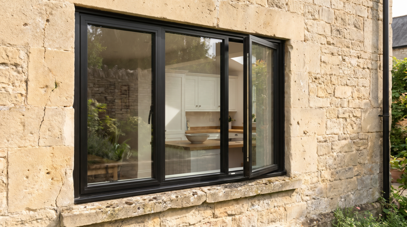
What Window Colours Suit Cotswold Stone Homes?
Window colours for Cotswold stone homes should be chosen against the actual building, rather than a generic image of honey-coloured stone. Whites, creams, muted greens, blue-greys and darker contrasts can all merit consideration in the right context. None is an automatically correct choice for every cottage, estate house or new addition.
Stone tone, mortar, roof, window proportions and existing joinery all influence the result. History and property-specific controls can matter too. This guide offers a practical way to develop and test a shortlist, with planning discussion focused on England. Colour recommendations are design judgments, not a region-wide approved palette, and choosing a finish should not become an assumption that significant existing windows need replacement.
Identify the Stone You Actually Have
Begin outside, looking at the whole elevation rather than a loose stone sample. Notice the variation within the wall, the mortar and any repairs or additions. The surface beside a shaded opening may appear different from stone in direct sunlight. Those relationships form the setting for the frame, so the building itself is a better starting point than an edited photograph of another property.
Cotswold stone is not uniformly honey-coloured. Cotswold District’s design code recognises variation from lighter creams and greyer tones to richer colours. This provides useful local context without describing every building across the wider Cotswolds. Assess the stone at the actual address, including weathering and previous work, rather than choosing a finish from a simplified north-to-south colour rule for the region.
Look at mortar as part of the palette. Its visibility and tone can influence whether the wall reads as a unified surface or a pattern of individual stones. Roof coverings, lintels and sills also contribute. A finish that relates well to one stone block may feel less comfortable across the whole elevation when those other materials enter the view from the road or garden.
Record a few representative viewpoints before assembling colour options. Include close views at the opening and a position where the whole house can be judged. Photographs can help organise observations, but should not replace reviewing materials on site. The aim is to identify what the frame needs to relate to, with enough context to distinguish a colour concern from differences in lighting, surrounding materials or composition.
Look at the Building’s History and Existing Joinery
Before choosing a new colour, ask whether the building already has an established scheme worth understanding. Surviving joinery, earlier photographs, estate records or previous approved details may provide evidence. A current coat of paint is not necessarily the original finish, but it may still belong to a considered later scheme. Investigate before treating the elevation as a blank canvas for a replacement palette.
Significant windows deserve assessment beyond their surface colour. Their glass, profiles, fittings and operation can contribute to the building’s character. Historic England’s window guidance supports understanding significance before intervention. A colour decision can therefore lead to appropriate repair and redecoration where justified, rather than automatically becoming an order to remove and replace otherwise serviceable joinery throughout the property.
Consider the wider group where a house forms part of an estate or composed street. Repeated finishes and window patterns can create a relationship that matters from shared viewpoints. Neighbouring buildings are useful evidence of context, but their present colours do not establish historical accuracy or permission for another property. Some may have different histories, consent conditions or significance from the home being considered.
Ask an appropriate heritage adviser about investigation where the evidence is important. Avoid scraping significant surfaces or assuming an exposed layer supplies a complete answer without interpretation. Record what is known and what remains uncertain, then use that information to shape the shortlist. This creates a defensible starting point for design and any necessary approval, while leaving room for a suitable new scheme where the context supports change.
Test Whites, Creams and Softer Neutral Colours
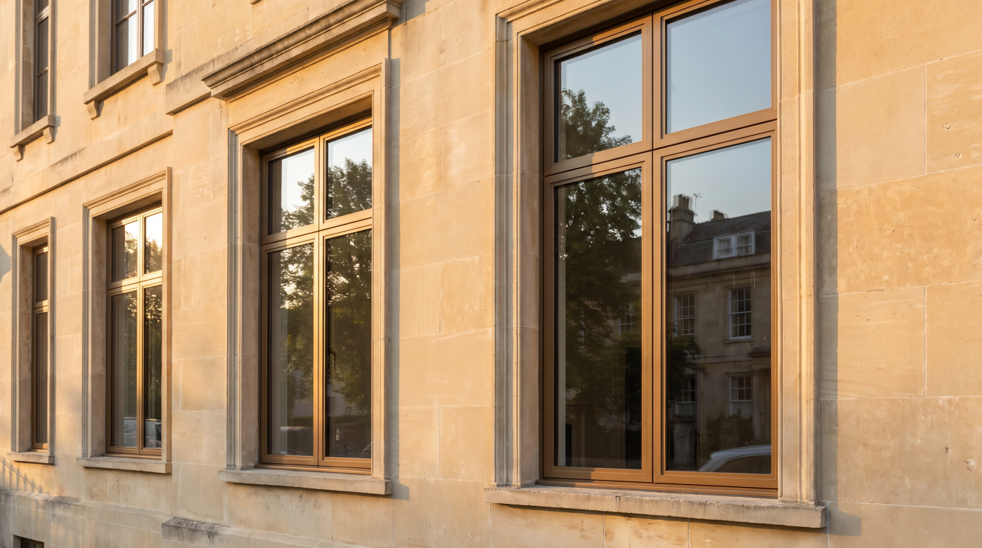
Light finishes offer a useful starting family, but white is not one consistent appearance. Compare warmer and cooler samples, creams and softer neutrals against the stone and roof. Ask whether the frame should stand out or sit more quietly within the elevation. The choice is a design relationship to test, rather than a rule that every traditional stone house must have the same pale joinery.
A brighter white can give a clear outline where that suits the architecture. On another building, it may make the window pattern more prominent than intended. Cream or a softer neutral may be worth testing in that situation, but should not be selected merely because the stone is described as warm. Judge the actual sample and the complete frame proportions together from the relevant viewpoints.
Pay attention to how much painted or coated surface will be visible. A wide opening frame and a delicate historic casement can present the same nominal colour very differently across an elevation. More frame area changes the balance with the glass and wall. If the result feels visually heavy, establish whether colour is the issue or whether the proposed sections and subdivisions need reconsideration.
Keep the shortlist manageable. Several closely related light samples can be more informative than a large collection of unrelated shades. Review them outside at the opening, then against doors and other joinery where coordination matters. The final choice should explain the intended relationship with the property, without promising that one finish will make every stone appear warmer, brighter or more expensive from every angle.
Consider Muted Greens, Blue-Greys and Estate-Informed Shades
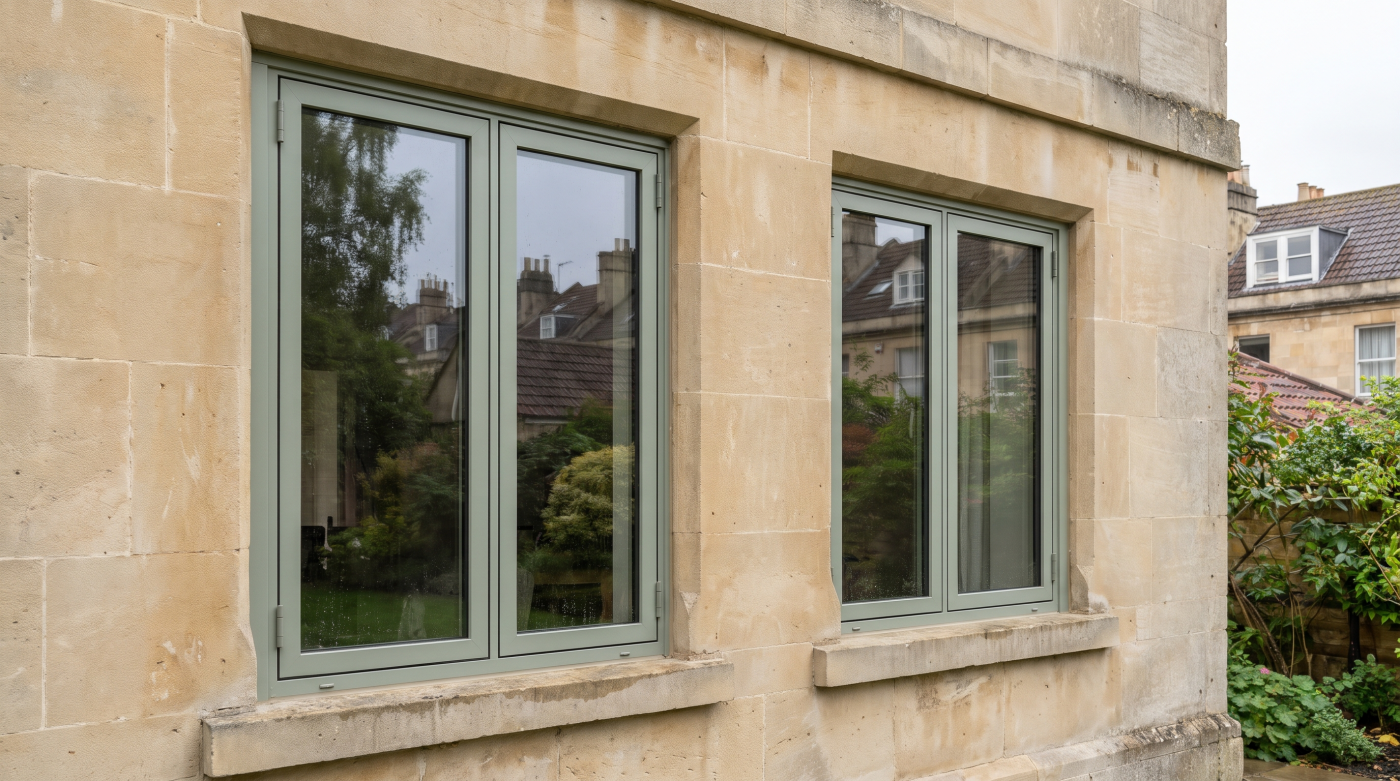
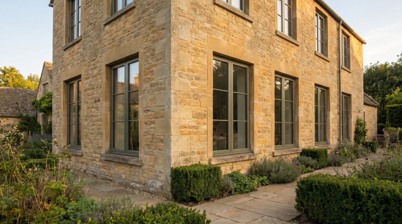
Muted colour can offer another route where a pale neutral does not produce the intended relationship. Greens and blue-greys deserve consideration as families rather than fixed recipes. Compare their undertones with the actual wall, roof and setting. A photograph showing an attractive green window in a garden does not establish that a similarly named finish will have the same effect on a different building.
Cotswold District Council’s traditional-casement guide, published in 2013, records cream, pale blue, grey and slate green among estate colours. This is useful historical context, not a current permission to apply any shade in those families to every property. The guide concerns traditional casements; its colour discussion should not be expanded into a universal approval for all materials, finishes or replacement arrangements.
Where a known estate scheme survives, investigate its actual colour and specification rather than substituting a product with a locally suggestive name. Names can be useful labels for samples, but do not establish historical provenance. Ask what reference is being proposed and why it relates to the house. If evidence is incomplete, describe the choice honestly as a contextual design judgment rather than a verified reinstatement.
Review muted finishes with the whole building in view. The same green may feel restrained against one wall and more assertive against another. Garden planting can inform the composition without becoming a permanent colour reference through every season. The useful question is whether the finish remains coherent with the architecture and principal materials, including when foliage changes or the view is taken from the street rather than the garden.
Decide Whether a Darker Contrast Suits the Architecture
Darker frames can create a more defined outline against stone, but should not be a default choice simply because they appear contemporary. Consider the architectural role of the opening. A new glazed addition can have a different relationship with the house from a row of retained windows on its principal elevation. The relevant test is the composition and context, rather than the age implied by a colour.
Examine the frame pattern before deciding how strong that contrast should be. Darker lines may emphasise a well-resolved proportion, or draw attention to subdivisions that already feel busy. Review the actual fixed and opening sections together, including mullions and adjoining doors. An attractive photograph of apparently minimal framing may omit components that are necessary in the proposed system, dimensions and operating arrangement for the project.
Look at existing metalwork and roof materials without requiring every dark element to match. A deliberate relationship can work better than a series of loosely similar finishes described by the same general colour. Conversely, choosing dark frames does not require changing all retained joinery to match them. A house and its addition can have distinct treatments where that distinction is architecturally justified and any relevant controls allow it.
Test the options from a distance as well as close to the opening. Consider how the glass and interior appear beside the chosen finish. Darker frames do not automatically disappear, and a pale frame does not automatically make the opening visually smaller or larger. These are effects to judge in the actual design, with no universal claim about elegance, suitability or the value the finished property might achieve.
Compare Finish, Texture and Material as Well as Colour
A colour reference is only part of a finish specification. Painted timber, coated metal and other surfaces can present different texture, sheen and detailing. Ask for a representative sample from the intended system and finish range. A name or code on a quotation does not explain all of those qualities, and a sample from another product should not be assumed to represent the proposed assembly exactly.
Look at the sample’s relationship with the frame profile. Corners, joints, beads and opening components contribute to the overall impression. Where possible, review a relevant section or larger assembly rather than a small flat chip alone. This helps distinguish whether the attraction lies in the colour, the surface character or the finely resolved joinery seen in the original inspiration image being used for comparison.
Use digital images to explore ideas and communicate a shortlist, then ground the final choice in physical materials. Photographs and screens cannot reproduce every aspect of a finish in the home’s changing light. Review samples outside at useful times and positions, avoiding a decision made only under showroom lighting. The objective is confidence in the real combination rather than a precise match to an edited online photograph.
Confirm the finish available for the selected product, including any different internal and external options. Do not assume all systems offer the same colours, textures or repair arrangements. Record care requirements and any relevant warranty conditions before ordering. A finish that suits the design should also have a maintenance approach the household understands, without a universal promise that every coated or painted surface will age in the same way.
Check the Rules That Apply to This Property
Establish the relevant authority and property status before treating a shortlist as an order. The wider Cotswolds spans different planning areas, and Cotswold District Council’s guidance cannot determine every address. A stone building is not automatically listed, while an unlisted property can still have relevant controls. Check the actual position rather than inferring it from the building’s appearance, age or location within a familiar village.
Listed building consent and planning permission are separate questions. Historic England’s permissions guidance explains the significance of alterations and local controls such as Article 4 directions. A change described as redecoration or replacement may need careful assessment in its particular context. Seek advice about the proposed work, including the finish, rather than relying on a general description of what a neighbour was allowed to do.
Existing conditions and approved details may also matter. Read the relevant records and establish whether a particular material or colour has been specified. Cotswold District’s retrofit permissions guidance recognises that rights and controls can change and advises checking uncertainty. Its summary is a starting point within that authority’s scope, not a substitute for reviewing the actual property, proposal and applicable requirements before work begins.
Keep building-control and lease responsibilities separate where relevant, particularly when a colour discussion forms part of wider window replacement. An agreeable palette does not establish compliance or permission for a different window design. Resolve these matters early enough to inform samples and manufacturing choices. That avoids asking the homeowner to approve a finish before the underlying material, profile or intervention has been found appropriate for the building.
Create a Coherent Shortlist and Record the Final Specification
Choose a few options that represent different, intentional relationships with the house. One might offer a quieter pale finish, another a muted colour and another a stronger contrast where appropriate. Compare each against the same stone, roof and window drawings. This makes the decision clearer than repeatedly adding attractive shades without deciding what role the frame should play within the elevation and wider setting.
Include the view from inside and the relationship with retained openings. Coordinate doors and other materials without assuming every component must use an identical finish. A contemporary addition and an older house can remain coherent through proportion and detail as well as colour. Record the reason for any deliberate difference so later decisions do not gradually replace a considered composition with unrelated choices made by separate trades.
Before ordering, identify the exact system, colour reference, surface finish and any internal variation. Keep the relevant samples, drawings and written approvals where needed. Agree who reviews substitutions and how future repairs will be specified. That record is more useful than a broad label such as heritage green, especially if another component is ordered later or a different contractor carries out maintenance several years after completion.
CBP’s architectural glazing and specification role supports this coordinated process with homeowners, architects and designers across the Cotswolds and surrounding region. The most convincing colour is one that belongs to the actual home, with its stone, history and intended new work understood. A careful sample review helps turn inspiration into a clear specification, without inventing a single correct palette or letting colour alone decide whether windows should be replaced.