
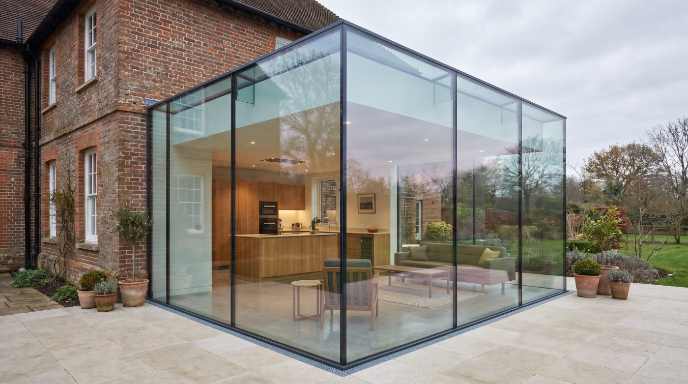
The Extension Is Usually Not Ruined by the Big Idea
Most extensions are judged first by their largest gestures. How much glass should there be? Should the new structure contrast with the original house or feel more continuous? Where should the main opening sit, and how should the room connect to the garden?
Those decisions matter, but they are rarely the only reason an extension feels successful. In practice, the difference between a design that feels resolved and one that feels slightly awkward often appears at a much smaller scale.
A frame may sit too prominently within the wall. A threshold may interrupt what was intended to feel like a continuous transition between inside and outside. Two materials may meet without a clear visual relationship. None of these details necessarily undermines the entire project, but each can attract more attention than expected because it sits at the point where one architectural idea meets another.
That is why a strong concept is only the beginning. Once the overall form, openings and material palette are established, the focus needs to move towards the junctions. How does the glazing meet the wall? Where does the internal floor finish stop? How is the transition to the external surface handled? What happens where old construction meets new?
These are not secondary aesthetic questions. They are part of how the extension is actually experienced.
The best projects often feel simple because the difficult relationships have been considered carefully. Nothing appears accidental, and no single junction competes with the larger architectural idea.
If an extension looks almost perfect on the drawings, the next step is not necessarily to add more design. It is to examine the places where the existing design could lose clarity once it is built.
The Threshold Is Where Good Design Often Falls Apart
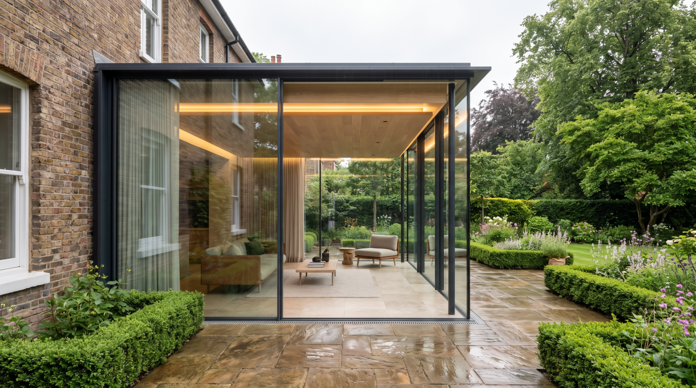
Few details expose the quality of an extension as clearly as the threshold between inside and outside. On drawings, a large glazed opening can suggest a seamless connection to the garden. In reality, that sense of continuity depends on how the internal floor, door frame, external paving and surrounding construction meet.
If those levels are not considered together, the threshold can become visually heavy or awkward. A raised step, an unexpected change in material or a bulky junction can interrupt the very relationship the glazing was intended to create. The door may still function perfectly, but the architectural effect can feel less resolved.
This is not simply about making everything appear flush. Threshold design also needs to account for weather protection, drainage, accessibility and the construction on both sides of the opening. Those requirements vary from project to project, which is why the detail should be coordinated rather than assumed.
I would want the threshold discussed before internal floor build-ups and external landscaping are treated as fixed. The glazing specialist, architect and builder all have a role in understanding how the opening sits within those levels and what the finished junction is meant to look like.
The important point is that the threshold is not a finishing detail added after the door system has been chosen. It is where interior architecture, glazing and landscape physically meet.
When that junction is resolved well, the transition can feel calm and deliberate. When it is not, the eye notices immediately. The opening may still be generous and the garden still attractive, but the detail between them can undermine the sense of simplicity the design was trying to achieve.
Frame Sightlines Can Change the Whole Elevation
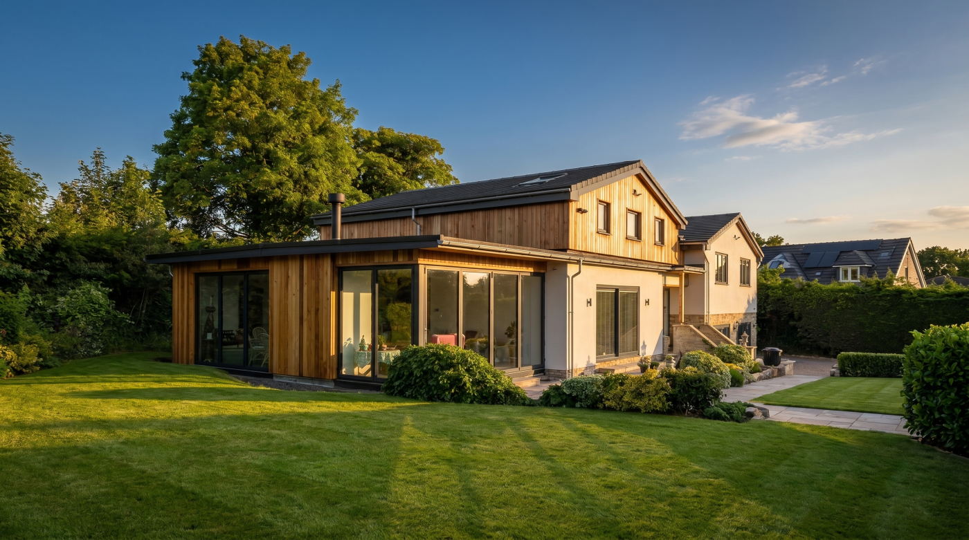
The proportions of the glazing can influence an extension more than homeowners expect. A frame that appears minimal in a product image may still create a strong visual rhythm once it is repeated across a wide opening or viewed as part of the complete elevation.
Mullions, meeting sections and opening elements all contribute to that rhythm. A single vertical division may feel balanced within one opening but disruptive within another. Several repeated frame lines can make an elevation feel ordered and deliberate, or they can begin to compete with the architecture around them if their positions have not been considered carefully.
I would look at these sightlines from both inside and outside. Internally, a frame division might cut across an important view or sit directly in front of a place where someone will regularly sit. Externally, the same division may need to relate to wall openings, structural lines or other windows across the façade.
This is why I would avoid judging a glazing system from one isolated profile photograph. The exact arrangement matters. A fixed pane, opening section or sliding meeting point can each create a different visual effect, even when they belong to the same broader system.
The aim is not to remove every visible frame line. In many designs, those lines help establish order and proportion. What matters is that they feel intentional.
When the sightlines support the architecture, the glazing tends to feel calmer and more integrated. When they are treated as a secondary product detail, they can become one of the first things the eye notices in an otherwise carefully designed extension.
The Reveal Can Make a Window Feel Elegant or Awkward
The wall around a window has almost as much influence on its appearance as the frame itself. A window does not simply sit in an opening; it sits within the depth of the wall, and that relationship can determine whether the glazing feels refined, recessed and intentional or unexpectedly prominent.
A deeper reveal can create shadow and allow the frame to sit more quietly within the architecture. In another construction, the frame may sit closer to the internal surface, making it feel more immediate in the room. Neither approach is inherently better. What matters is whether the position of the frame supports the proportions and material language of the extension.
I would pay attention to the surfaces around the opening as well. Plaster, timber, stone, brick or cladding can all change how the reveal is read. A crisp transition between materials can reinforce the architectural idea, while an unresolved junction can make the window feel like an object added afterwards rather than part of the building.
Consistency matters too. If similar windows sit at noticeably different depths without a clear reason, the elevation can begin to feel unsettled. Small variations that seem insignificant on a drawing may become much more visible once light and shadow begin to emphasise them.
This is why I would ask not only what the frame looks like, but where it sits within the wall and how the surrounding surfaces meet it.
The opening is more than glass and aluminium, timber or another frame material. It includes the reveal, the shadow line and the transition into the wall. When those elements are considered together, the window tends to feel integrated. When they are not, even an otherwise elegant frame can look awkward.
The Junction Between Old and New Needs a Clear Idea
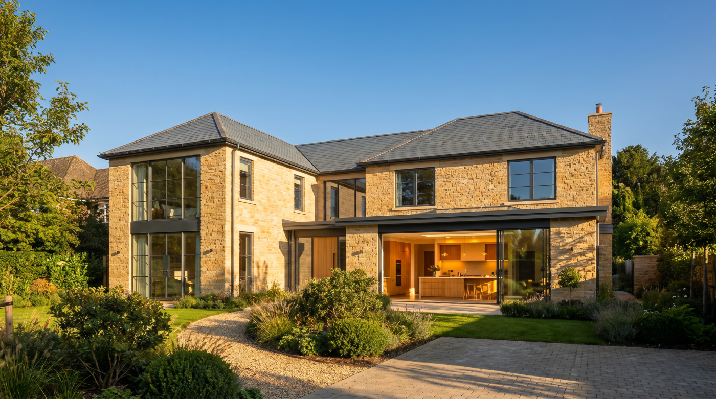
When an extension is added to an existing house, one of the most important design decisions is how the new work relates to what was already there. The junction between the two can be quiet and continuous, deliberately contrasting or expressed as a distinct transition. Problems tend to arise when that relationship is not clearly resolved.
A contemporary glazed link, for example, can create separation between an older building and a new addition, allowing each part to retain its own character. In another project, the intention may be to continue materials or proportions so that the extension feels more closely connected to the original house. Neither approach is automatically better. What matters is that the architectural idea is clear.
The glazing often plays an important role at this point of transition. Its position, frame proportions and relationship with adjacent materials can determine whether the junction feels deliberate or visually uncertain. A narrow connection that looks elegant on plan may feel awkward in reality if the surrounding wall, roof or floor relationships are not coordinated with the same care.
In period properties, the significance of the existing fabric adds another layer. Original materials, openings and details may contribute to the character of the building, and any proposed alteration should be considered accordingly. Where a property is listed, relevant consent requirements may also need to be established before work proceeds.
I would therefore ask a simple question early in the design process: is the extension meant to belong closely to the existing house, or is the transition intended to be visible?
Once that is understood, the junction can be designed consistently. The connection between old and new then becomes part of the architectural composition rather than an awkward gap between two separate pieces of building.
The Finish You Choose Can Expose Weak Proportions
When a detail feels wrong, it is tempting to keep changing the finish. A darker frame, a softer tone or a different surrounding material can alter the visual balance, but those choices cannot fully correct proportions that were unresolved from the start.
The geometry usually matters first. The size of the opening, the position of frame divisions and the relationship between glass and surrounding wall establish the underlying character of the elevation. Colour and material finish then emphasise or soften those decisions.
A dark frame against a pale wall may make every junction more visible. In another setting, a closer tonal relationship between frame and surrounding materials may allow the opening to feel quieter. Neither approach is inherently better. The effect depends on the architecture, the amount of contrast and how strongly the glazing is intended to register within the composition.
The same applies internally. Frame colour may relate beautifully to joinery, flooring or other finishes, yet an awkwardly placed mullion will still influence the room. Likewise, an elegant metal finish cannot disguise an opening whose proportions feel out of balance with the wall around it.
I would therefore avoid using colour as a way of solving a problem that is really about geometry. Before revisiting finishes, I would return to the elevation and ask whether the opening, frame lines and surrounding surfaces feel proportionate.
Once those relationships are working, the finish becomes much more powerful. It can reinforce contrast, create continuity or help the glazing sit more quietly within the scheme.
The strongest extensions usually get that sequence right: proportion first, finish second. The material palette then supports the architectural idea rather than being asked to rescue it.
These Details Need to Be Coordinated Before Site Forces the Answer
Many of the details that determine how refined an extension feels are created by several different trades working at the same junction. The glazing meets the structure, the internal floor, the external surface, the wall finish and sometimes bespoke joinery or cladding. If each part is considered separately, the final relationship can become more accidental than designed.
This is why coordination matters before construction removes the opportunity to adjust things easily. A threshold level, reveal depth or frame position may appear minor in isolation, but each can affect neighbouring elements. Once floor build-ups, openings or external surfaces are fixed, the remaining options may become much narrower.
I would want the architect, glazing specialist, builder and any relevant interior or landscape team to understand the same intended outcome. Drawings should help communicate that relationship clearly, while site discussions can confirm how the detail is being interpreted in the real building.
This does not mean every issue can be eliminated in advance. Existing properties often reveal conditions that were not visible during design, and some details still need project-specific resolution on site. The important point is that the architectural intention is already understood before those decisions are made under pressure.
When responsibility is fragmented, each trade may complete its own work correctly while the combined result still feels unresolved. The most visible details are often precisely where different packages meet.
I would therefore identify the critical junctions early and treat them as shared design problems rather than isolated trade responsibilities. That gives the project team a better chance of preserving the original architectural idea once construction reaches the point where drawings become physical, irreversible decisions.
The Best Extensions Feel Simple Because the Details Were Not
The most convincing extensions often look as though very little is happening. The glazing feels calm, the threshold appears effortless and the transition between old and new seems obvious. That apparent simplicity is usually the result of many small decisions being resolved carefully rather than the absence of detail.
The threshold has to relate to internal and external levels. Frame sightlines need to support the proportions of the elevation. Reveals, finishes and material junctions all need to reinforce the same architectural idea. None of these elements necessarily demands attention on its own, but together they determine whether the extension feels coherent.
I would not assume that every junction should disappear. Some details are stronger when they are expressed clearly. A deliberate shadow gap, a visible change in material or a distinct glazed connection between old and new can all contribute to the design. What matters is that these choices feel intentional rather than accidental.
This is why the final quality of an extension is often decided after the headline concept has already been agreed. The big moves establish the character of the project, but the smaller interfaces determine whether that character survives contact with construction.
I would therefore spend as much time reviewing the critical junctions as the main elevation. Where does the glazing meet the wall? How does the floor reach the threshold? What happens where materials change? Do the frame lines reinforce the composition?
The best extensions rarely feel complicated when they are finished. They feel clear. That clarity comes from resolving the difficult details early enough that, once built, they no longer draw attention to themselves.