
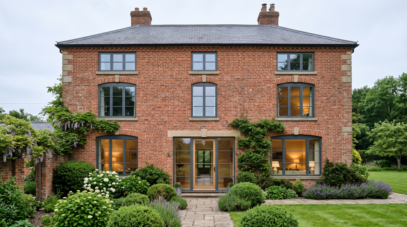
1. The rule is to look beyond the window
A window can look elegant in a showroom and awkward once placed in a house. Its frame may be well made, its glass carefully specified and its dimensions entirely ordinary. What fails is the relationship between that rectangle and the building around it.
Proportion is often discussed as though there were a correct numerical ratio. Historic buildings, contemporary houses and converted agricultural structures offer enough variation to show why that is inadequate. A tall opening may belong in one wall and feel cramped in another. A broad pane can frame a landscape beautifully while overwhelming a modest street façade.
The more useful rule is relational: design the window as part of an elevation and a room. Look at the amount of wall left around it, the rhythm of neighbouring openings, the height of the ceiling and the view from where people sit. Include the frame’s visible width, since the glass area may differ considerably from the masonry opening.
This approach does not make judgement vague. It gives the design team specific drawings to review: a whole elevation, a room plan, an interior view and a section through the wall. The question is whether the opening belongs in all of them. A ratio alone cannot provide that answer.
2. Balance glass and solid wall
An elevation is composed of openings and the wall between them. The solid parts give the façade weight, shelter corners and create places for the eye to rest. Increasing glass can improve light and view while weakening that composition if the remaining wall loses its purpose.
Consider a small rear extension. A broad garden door may be its principal gesture, but it still needs enough adjacent wall to support the roof, furnish the room and give the opening a clear edge. On a street elevation, a series of modest windows may derive its character from the spacing between them. Enlarging one to a fashionable width can disturb the whole rhythm.
This is not a case for small windows. It is a case for drawing the solid wall deliberately. What does it do structurally and visually? How does it frame the view through glass? Does an opening appear centred by intention or merely placed where services allowed? Even asymmetry can feel balanced when the reasons behind it are legible.
Review the building as a simple arrangement of solid and void before adding finishes or product details. If the composition already feels unsettled, a premium frame will not resolve it. If it has a convincing order, the eventual glazing can reinforce that architecture.
3. Alignments create order
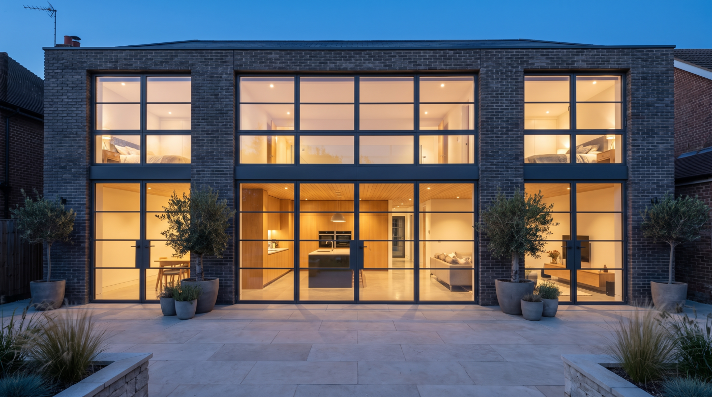
Windows relate to one another through their heads, sills, centres and spacing. Repeating one of these lines can make different openings feel part of a coherent façade. A small misalignment can be equally visible, particularly on a spare contemporary elevation.
Alignment need not mean uniformity. A stair window may be taller than a bedroom window; a garden door may descend to the floor while neighbouring openings sit above a sill. The design can still share a clear head line or a considered spacing rhythm. Where an exception is made, it should answer a need of the room or the architecture.
Existing buildings may have a strong order worth retaining. A later replacement can disrupt it through a thicker frame or a changed meeting rail even when the outer opening is unchanged. In new work, the designer can coordinate structural bays and interior room needs before openings are fixed, making alignment easier to achieve without forcing every window into the same shape.
Ask for a whole-elevation drawing at a scale where these lines are visible. Looking at individual product sheets will not reveal whether one sill sits uncomfortably above the next or whether a door division interrupts a view. The quality of the group matters more than the perfection of any isolated rectangle.
4. The frame changes the apparent proportion
A window opening and the glass visible within it are different shapes. Frame width, opening leaves, glazing bars and meeting points all alter the proportion a person actually perceives. Two systems installed in the same wall opening can therefore give the elevation different character.
A fixed pane may have a quieter outline than an operable window, while an opening sash brings hardware and additional frame members. A sliding door introduces a meeting stile whose position divides the view. Traditional glazing bars can give scale to a historic façade, but a heavy imitation can make the same opening feel crowded. These decisions belong to the composition, not only to product selection.
Frame depth matters as well. Set back within a reveal, a window gains shadow and may appear finer from the street. Brought forward, it can read as flatter and more assertive. The wall around it changes how its apparent dimensions are judged.
When comparing options, ask for elevations of the complete proposed assemblies at the intended size. Mark the visible glass area, divisions and frame-to-wall junction. A photograph of a different configuration is a useful reference but not proof that the final window will have the same proportion. What matters is the opening people will actually see.
5. The room has its own proportion
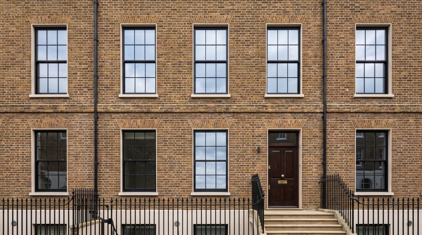
An opening may sit perfectly on the exterior and still fail the room behind it. A high sill can preserve façade order but deny a seated person the garden view. A wide, low window may illuminate a work surface while leaving a deep room dark at the back. Window proportion has an interior task as well as an exterior one.
Draw furniture before fixing the opening. A sofa, desk or kitchen worktop changes where useful light and view should fall. Consider the eye level of someone sitting and standing, the need for privacy and the position of handles. Ceiling height affects how tall a window feels within the room and how far daylight can reach.
The aim is not to sacrifice the façade whenever the interior asks for something different. It is to reconcile the two. A change in frame division, a shifted sill or a pair of related openings may answer the room while preserving the building’s rhythm. Sometimes the plan itself needs adjustment so that the desired view and exterior composition can coexist.
Walk through the proposed house on drawings. Imagine arriving in each room and looking towards the opening from the places where people will spend time. The proportion is successful when it gives the room light and outlook without making the building outside feel accidental.
6. Orientation affects size and placement
Windows of identical proportion can create very different conditions on different elevations. A north-facing opening may offer even daylight; a west-facing one can admit low afternoon sun. Surrounding buildings, trees and roof overhangs change the result again. The visual composition should therefore be tested against orientation and use.
A large window can be generous in one room and difficult in another if it brings glare or unwanted summer heat. Shading, ventilation and glass selection may help, but they work best when considered while size and position are still open to change. The National Model Design Code identifies the need to balance daylight, beneficial solar gain, heat loss and summer comfort when designing windows.
There is no contradiction between environmental performance and architectural proportion. The building’s orientation is part of its architecture. A carefully placed smaller opening may provide a better view and more comfortable light than a larger one chosen for symmetry alone. Elsewhere, a taller window may bring daylight farther into the plan without requiring the wall to be opened across its full width.
Test the proposed elevation through seasons and at the hours each room is used. The best proportion is not only pleasing on a drawing. It makes sense in the light and climate of the site.
7. Replacement should respect what exists
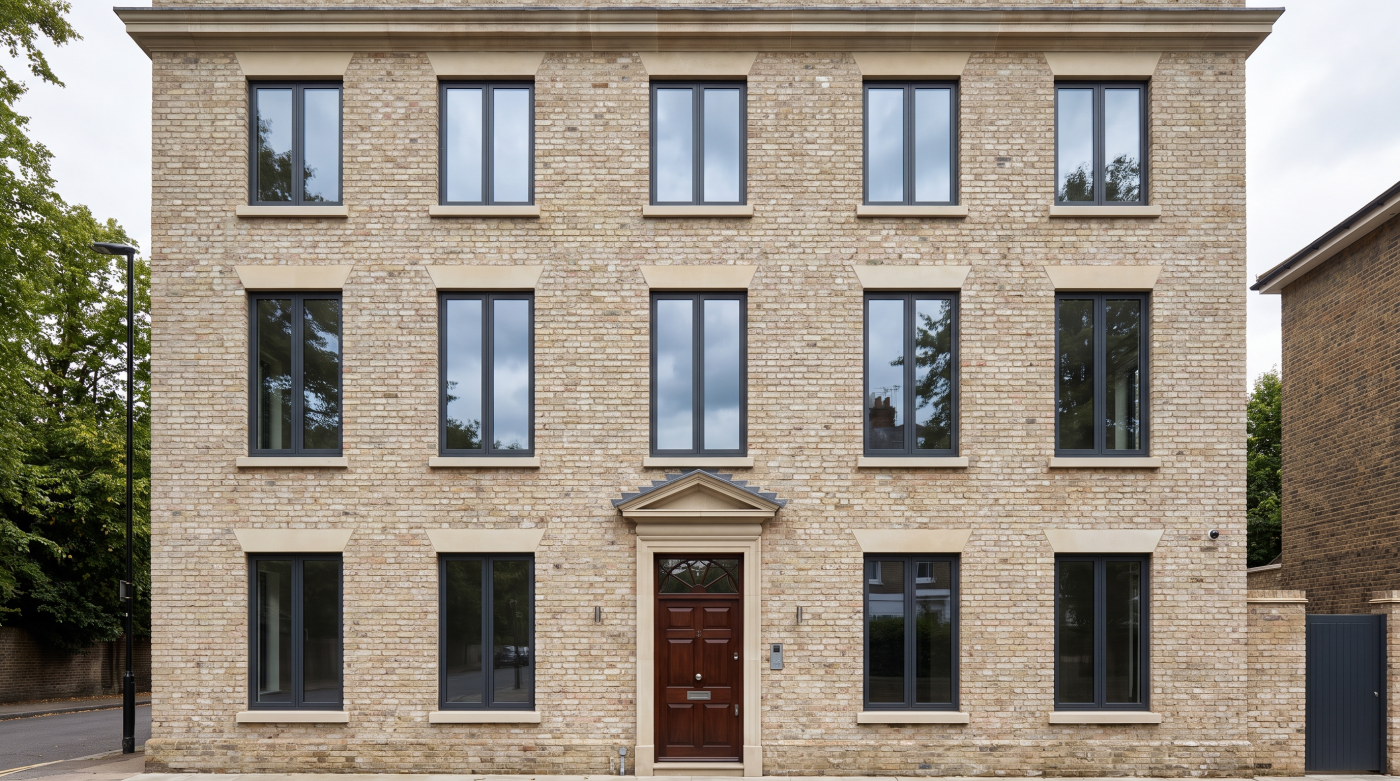
On an existing house, the opening may already be part of a valued composition. Replacing the window without changing the masonry can still alter that composition. A thicker frame, different glazing bars or a new position within the reveal can change the amount of glass seen and the depth of shadow around it.
Begin by recording the existing elevation. Which windows belong together? Are their proportions original, or have earlier replacements disturbed the pattern? In an older house, surviving glass and joinery may carry significance beyond appearance. Historic England advises assessing and repairing historic windows where possible before replacement is proposed.
Where replacement is justified, ask what the new window should preserve and what it should correct. An inappropriate later unit may be an opportunity to recover an elevation’s order. A sound historic window may be better retained and improved. Different openings in one house can therefore call for different interventions.
Proportion is not nostalgia for one style. It is an account of how the new or retained window relates to the building that holds it. Draw the proposed change beside the whole façade, and inspect the frame details at a scale that shows what will truly be visible.
8. A practical drawing test
The rule can be applied through four views. First, look at the whole elevation to judge the balance of wall and opening. Second, look from inside the room to test daylight, outlook and furniture. Third, study a section through the wall to understand frame position and reveal. Finally, inspect a full-size corner or opening sample to see the true frame lines.
These views should describe the actual proposed window, not a generic system. Include opening leaves, glazing divisions, sill and finished wall surfaces. If a detail changes during pricing, return to the whole elevation. A small substitution can alter an important alignment or make an opening feel heavier.
Ask what each window is doing. Does it belong to a repeated façade rhythm? Does it frame a specific view? Does its size suit the room and the direction it faces? If those answers are clear, an unusual proportion may be entirely right. If they are not, a familiar stock size may still look arbitrary.
There is no magic ratio for a good house. The discipline is to judge every opening in several relationships at once. That is the proportion rule worth keeping: the window, wall and room should read as parts of one design.